Arborwood Case study
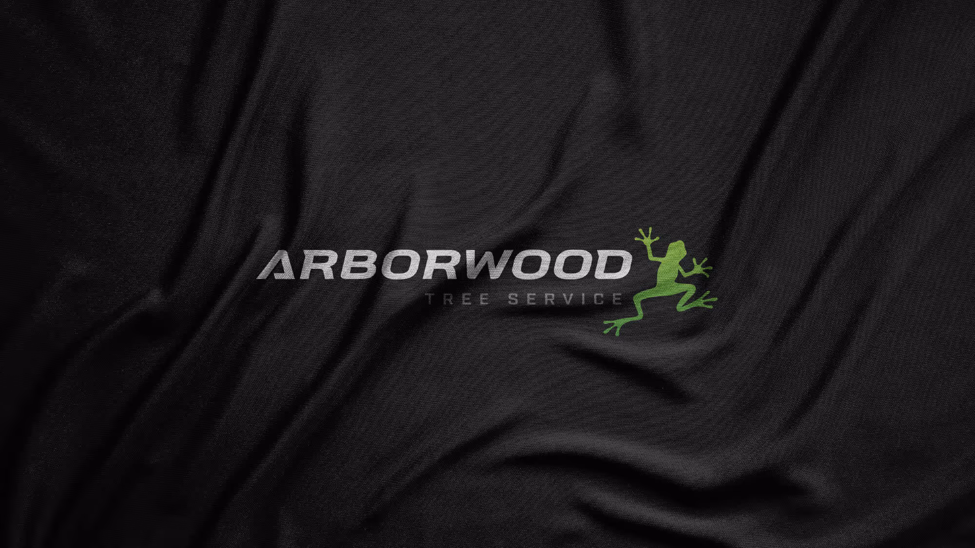
Arborwood’s original brand was designed in 2007 to help the company stand out from other tree service providers. But now in 2023, the logo no longer accurately represents Arborwood’s growth, capabilities, or market position. A refresh was needed. With strong brand recognition tied to their signature tree frog, keeping the icon was essential. The only other goal: elevate the design with a sense of coolness, professionalism, quality, and precision.
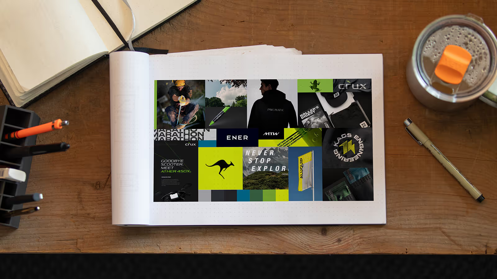
To guide the branding, we created a moodboard inspired by high-end outdoor adventure brands to illustrate how the brand could feel. This board keeps parts of the old branding while expanding into new territory, creating a direction that is the best of both.
Arborwood was already established with a brand that meant business. Tree climbing culture combined with a true knowledge of tree health. Our task was to update the brand identity system while keeping it instantly recognizable as Arborwood.
With over 15 years since the first Arborwood logo was created, it was feeling a little dated and the brand look was limiting. The team at Arborwood was seeing the need to refresh, but the question became “how much do we deviate from the brand that people have come to recognize?”
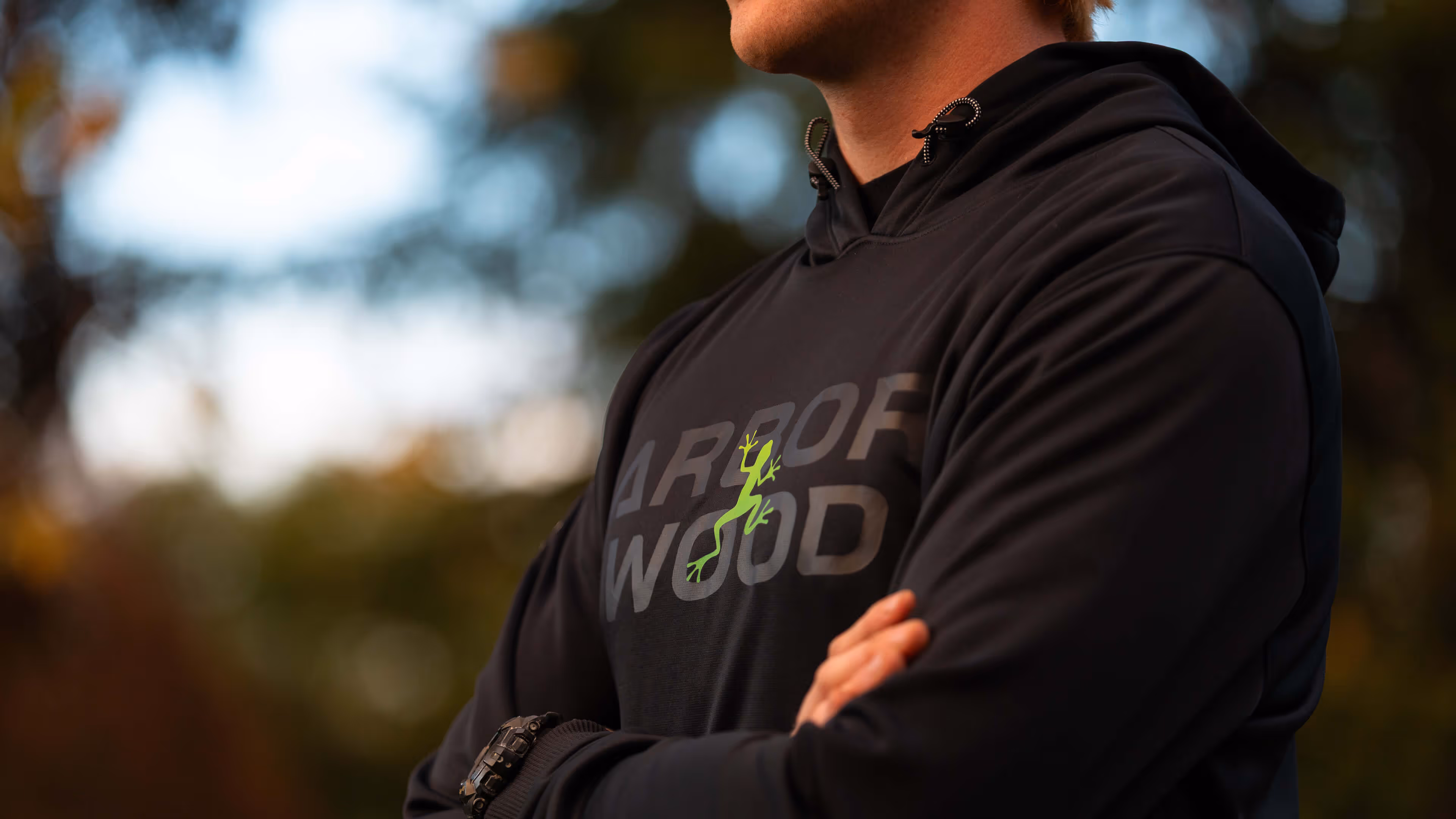
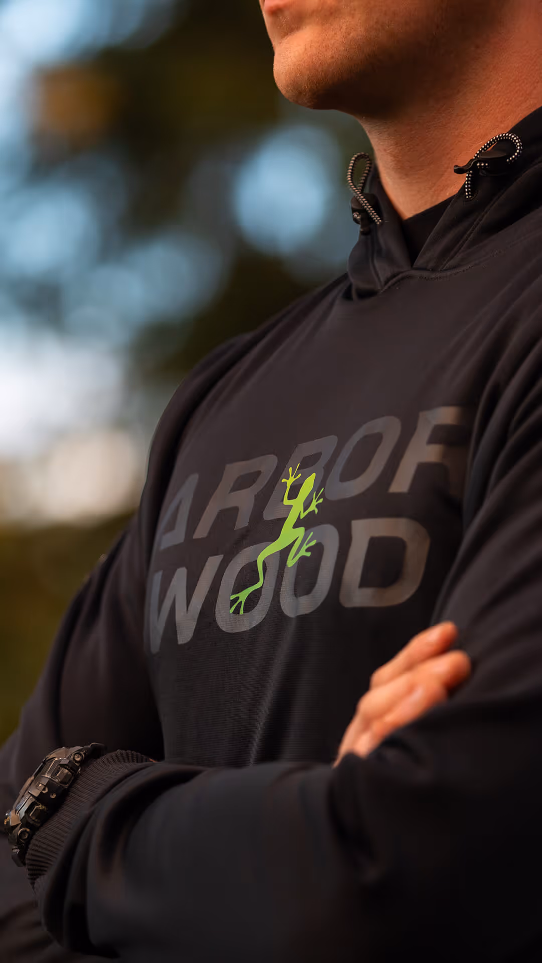
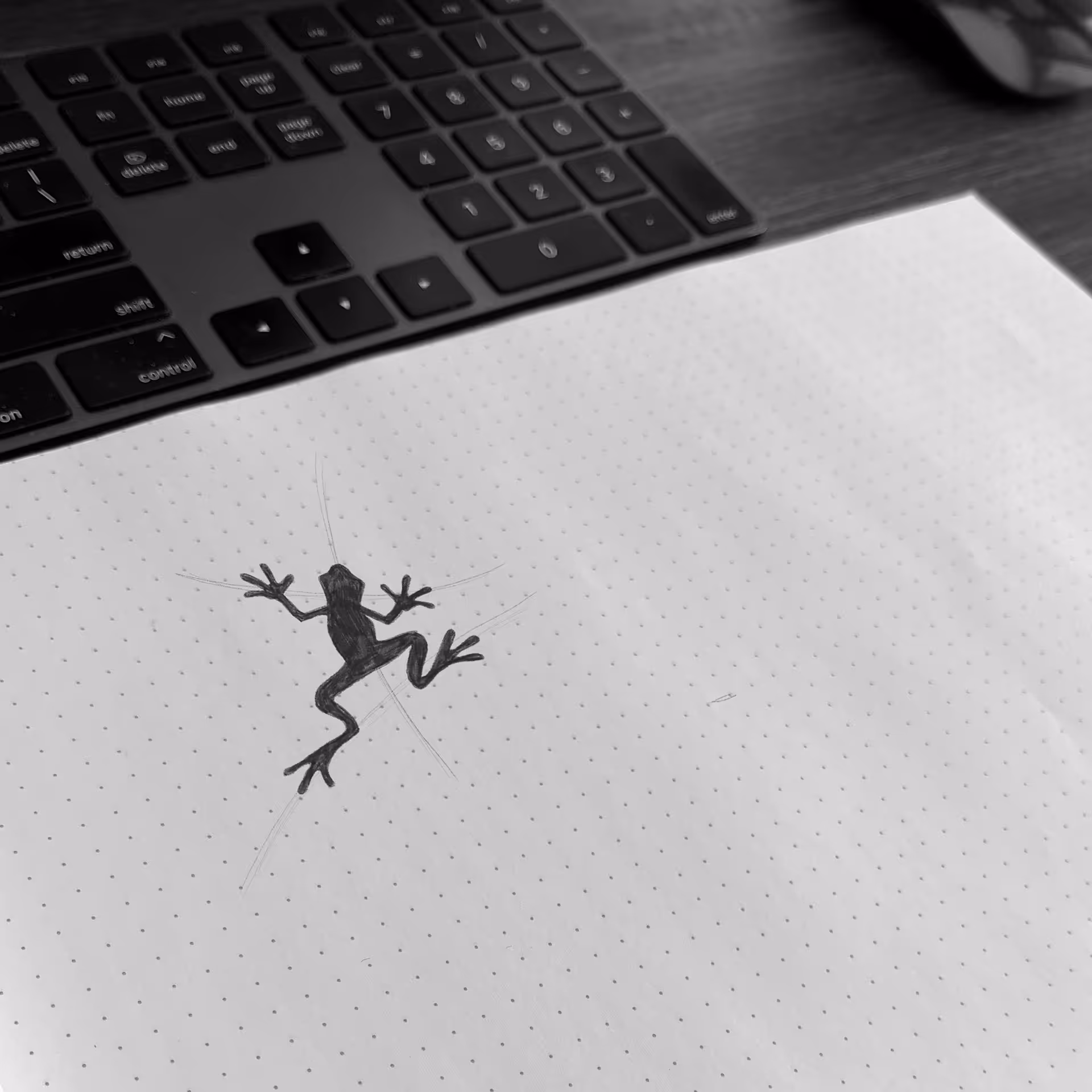
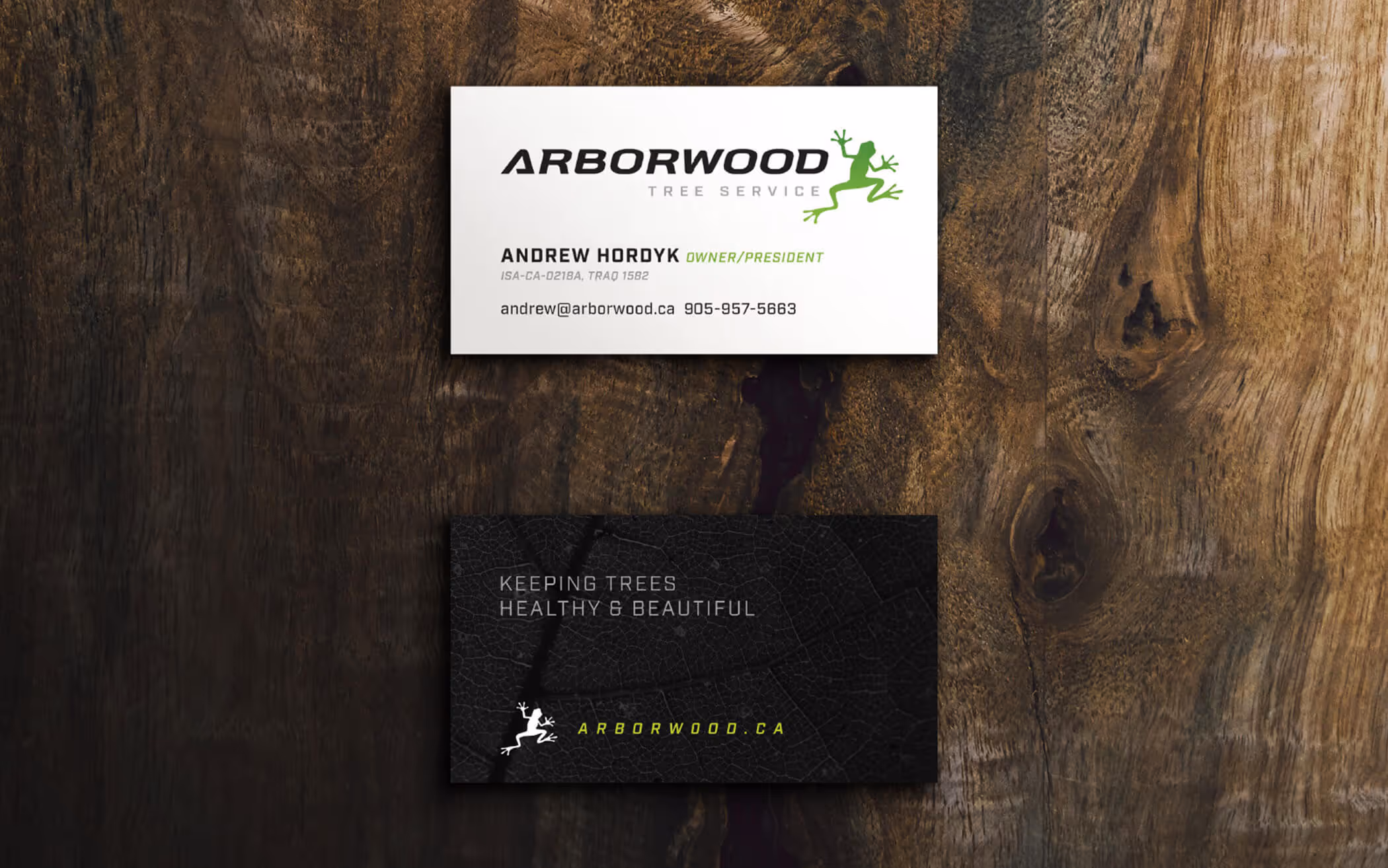
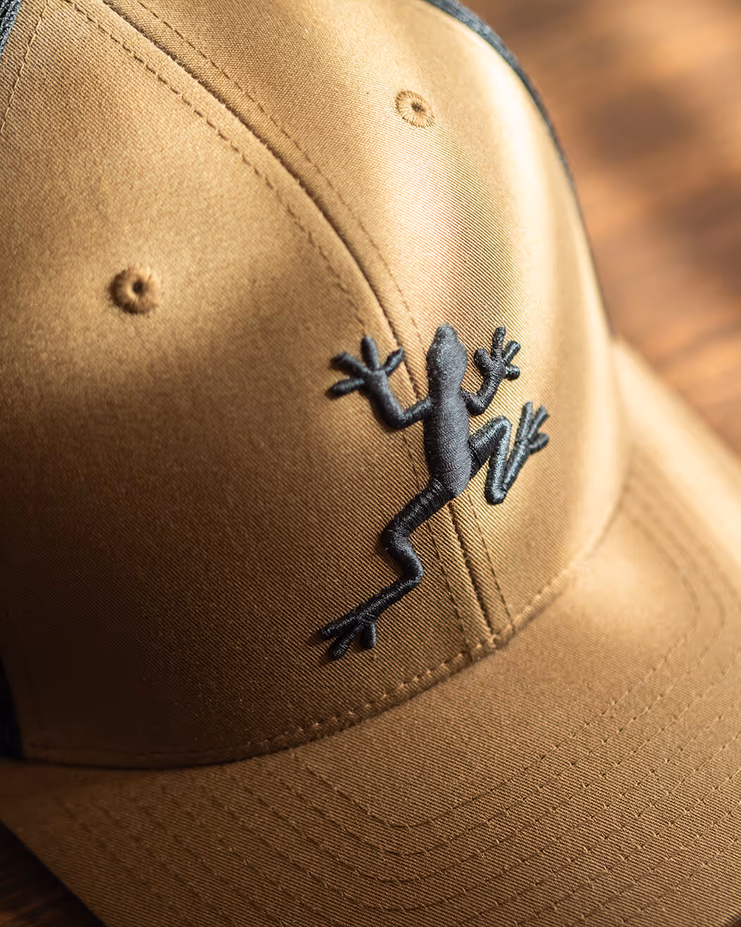
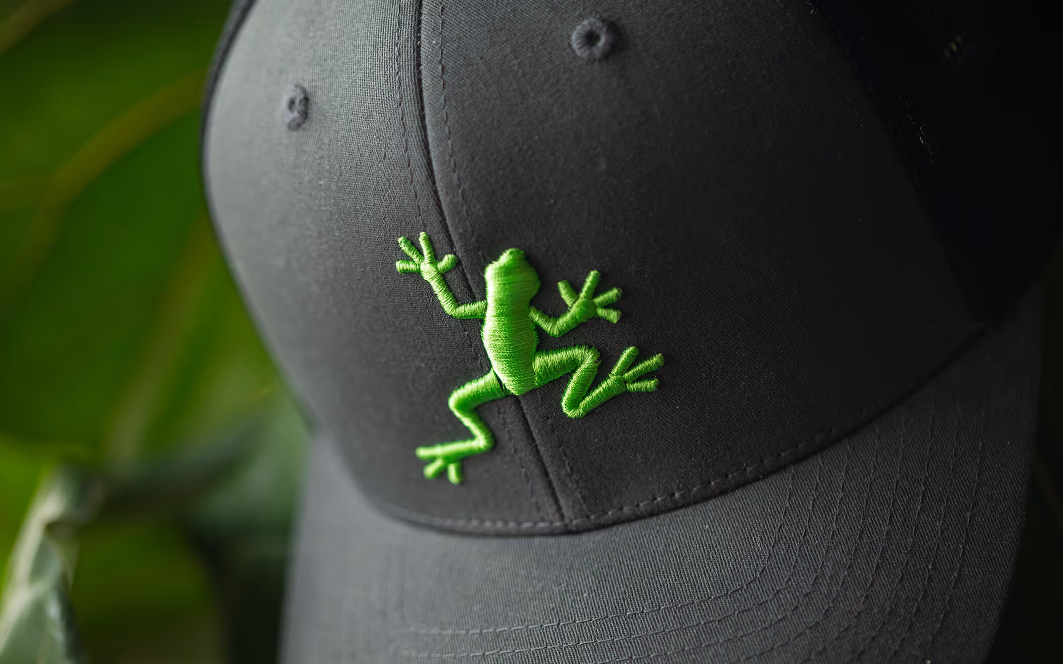
The original frog icon, while unique and recognizable, lacked energy and included more detail than necessary. Our task was to keep the frog’s pose and character but simplify the design to make it more iconic. By refining the lines and enlarging the toe pads, we created artwork that feels nimble and athletic and remains clear and distinctive at any size.
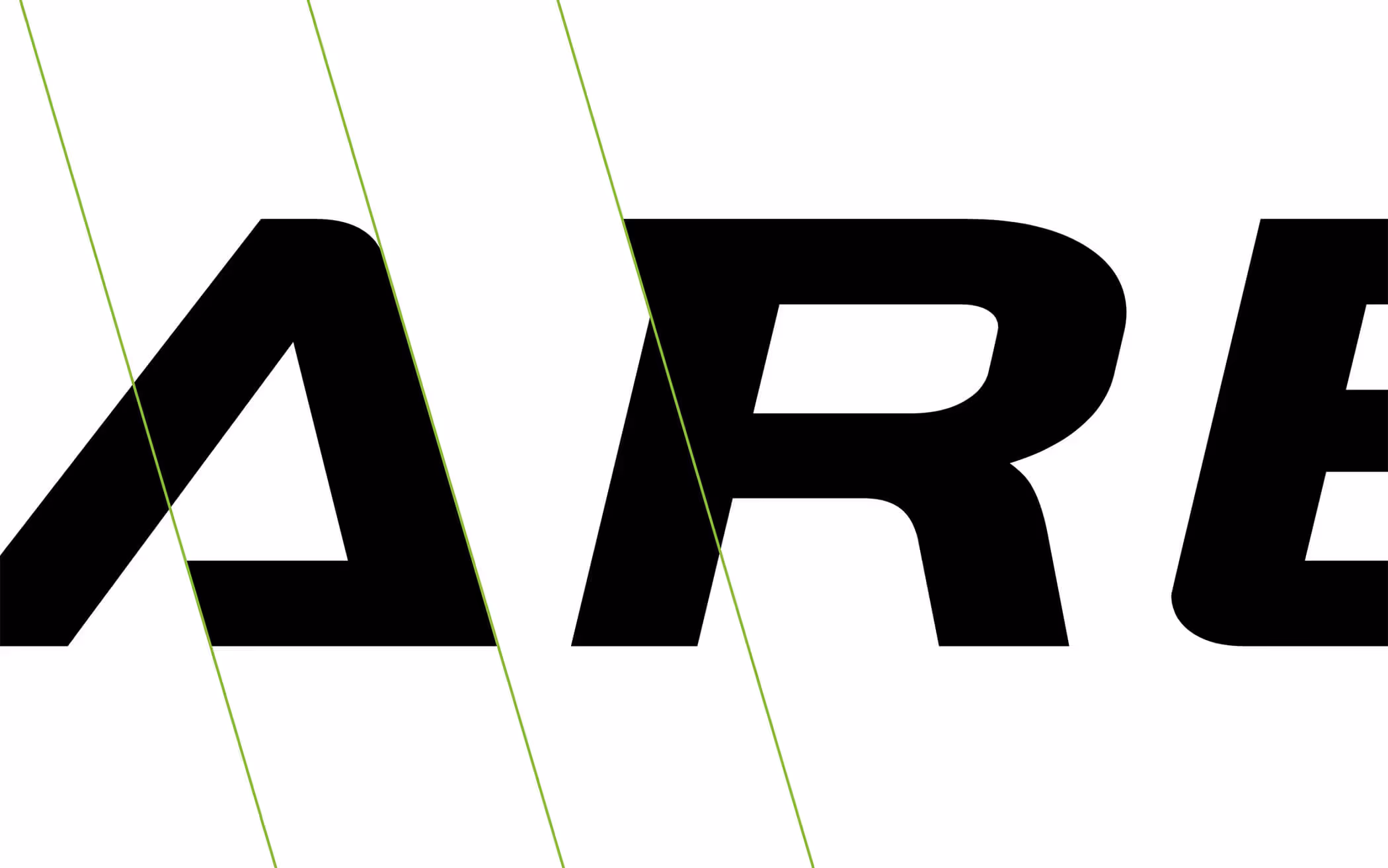
The typography needed to resonate with potential employees, clients, and reflect the nature of Arborwood’s work. We chose a bold italic sans serif with natural curves, complemented by distinctive hooks and a custom A for added personality and recognition.
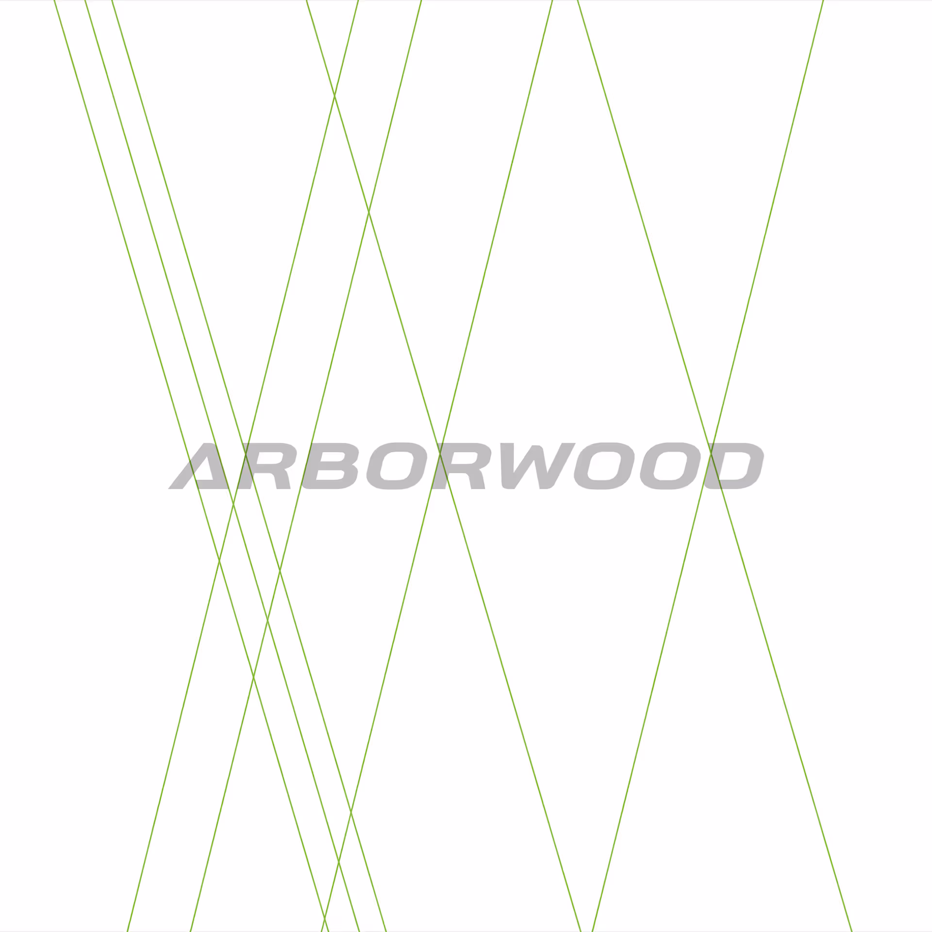
Breaking up the word “Arborwood” gave us the flexibility to develop dynamic logo variations that creatively adapt the branding to any space or application.


Arborwood was already established with a brand that meant business. Tree climbing culture combined with a true knowledge of tree health. Our task was to update the brand identity system while keeping it instantly recognizable as Arborwood.
After 15 years in business, Arborwood had grown significantly. The team recognized the need for a refresh that would better reflect their current position in the market. The question became “how much do we deviate from the brand that people have come to recognize?”
The original frog icon was unique and instantly recognizable, and the team was committed to keeping it. Our task was to preserve the frog’s pose and character while simplifying the design to make it more iconic. By refining the lines and enlarging the toe pads, we created artwork that feels nimble and athletic, and remains clear and distinctive at any size.
The typography needed to be refined to resonate with potential employees and clients, and also reflect the nature of Arborwood’s work. We chose a bold italic sans serif with natural curves, complemented by distinctive hooks and a custom A for added personality and recognition.
Breaking up the word “Arborwood” gave us the flexibility to develop dynamic logo variations that creatively adapt the branding to any space or application.
You don’t always need to start from scratch. Sometimes it’s about keeping the heart of your brand and letting go of what no longer fits. The key is staying current and clear while holding onto the recognition you’ve worked hard to earn. The Capture team is ready to help you navigate those tough decisions.


When we decided to do a brand refresh, we wanted to maintain what we had but modernize it without losing its essence. The Capture team was fully onboard, excited, and yes, they had great coffee too. Working with Capture has been nothing short of exceptional. We always felt like rockstars, and whenever there were small hiccups, they communicated promptly and fixed them without hesitation. Their artistry, ability to listen, and talent for bringing our vision to life are outstanding. We couldn’t be happier with the results.

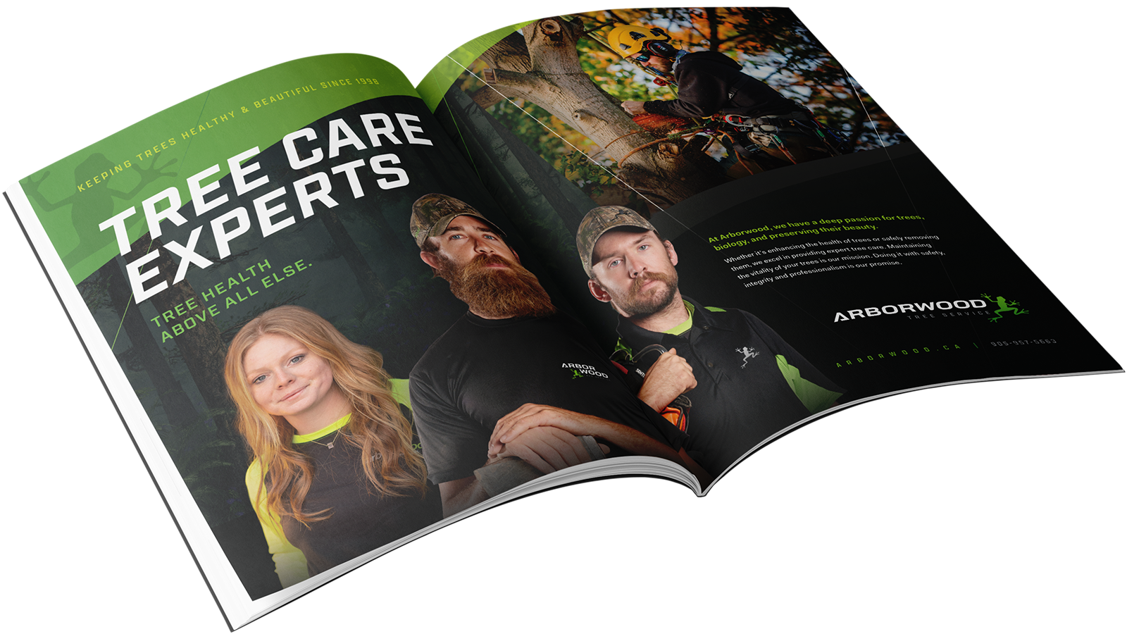
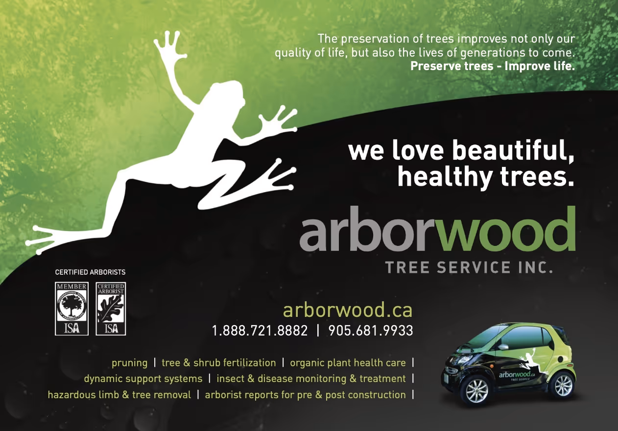
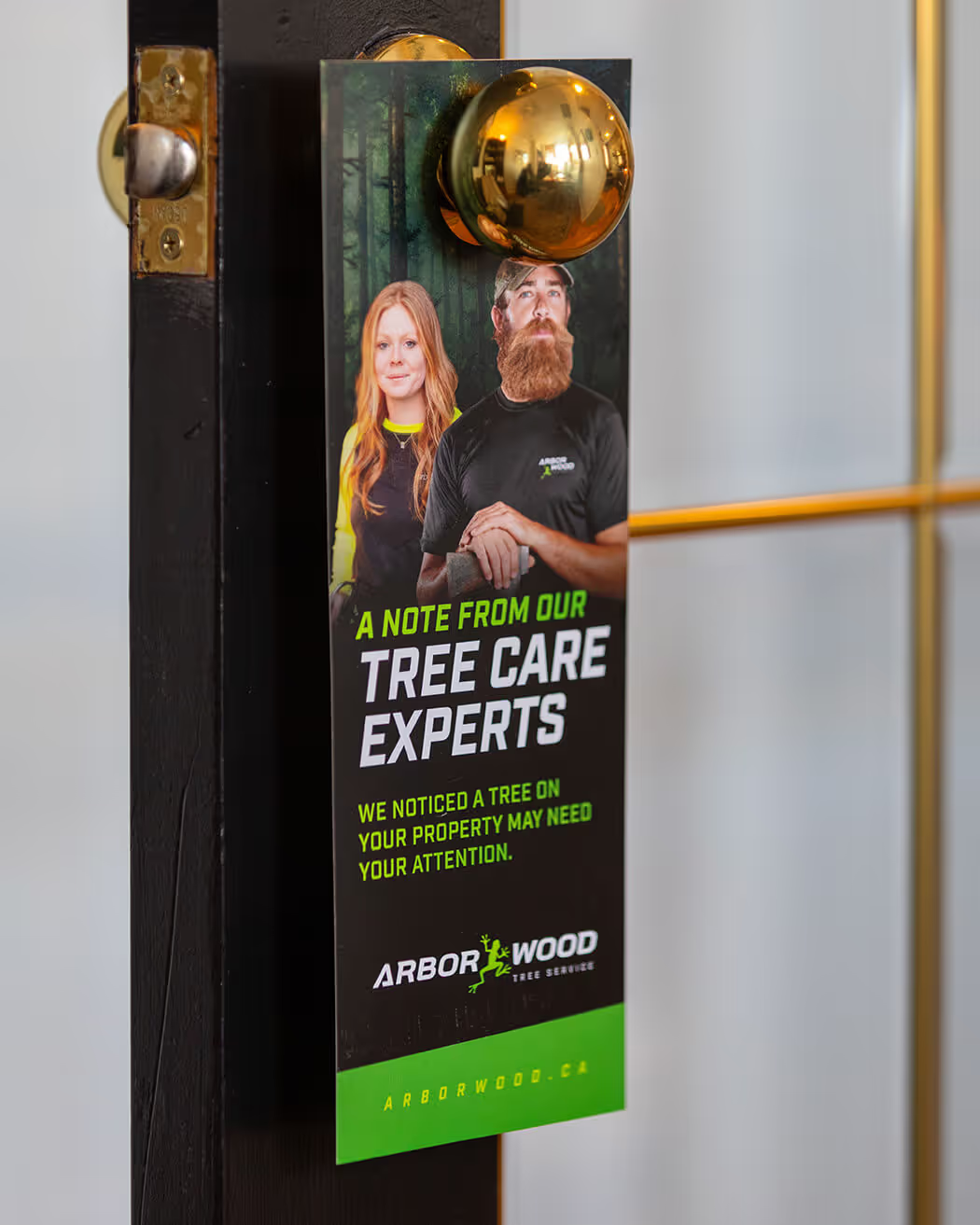
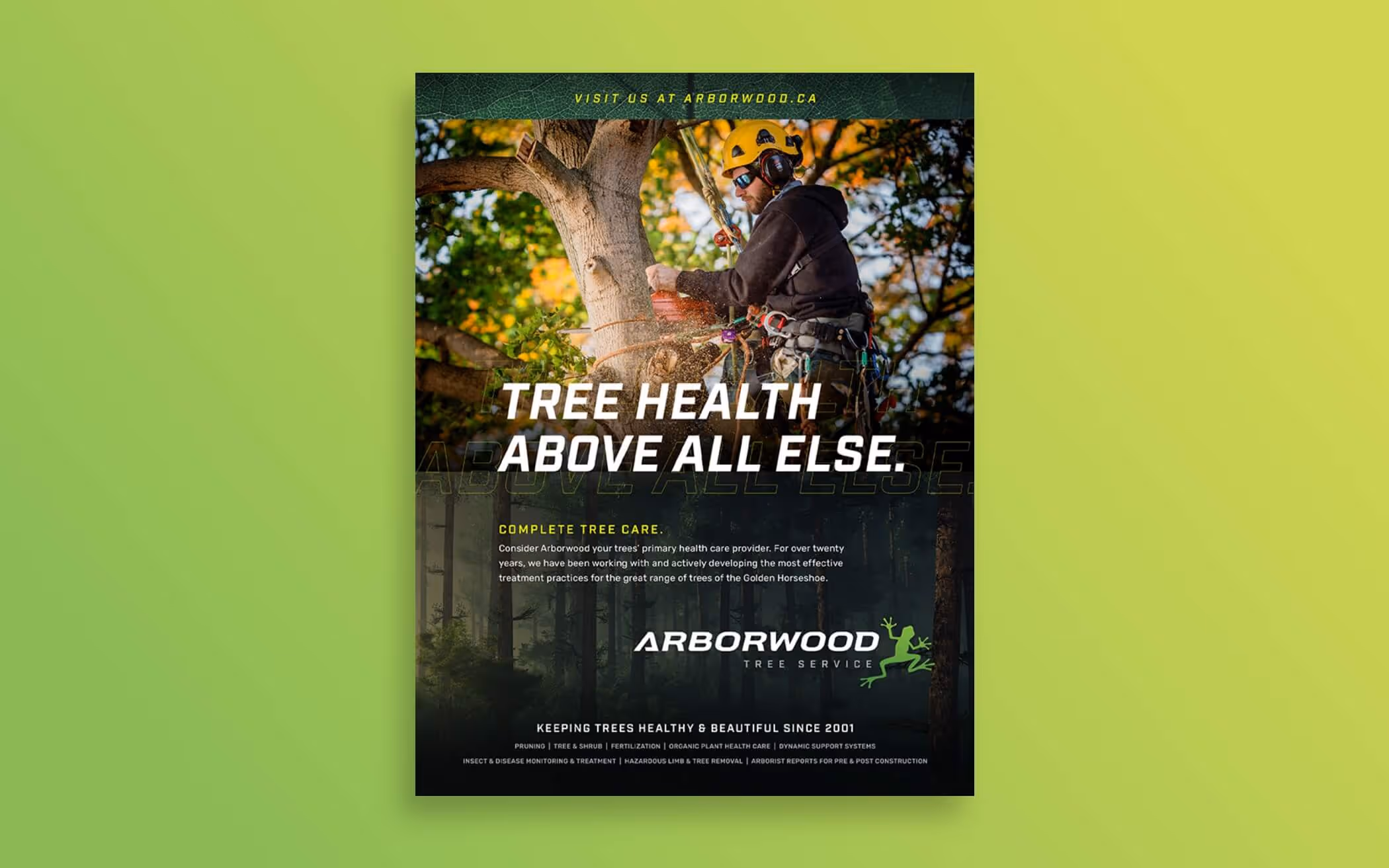
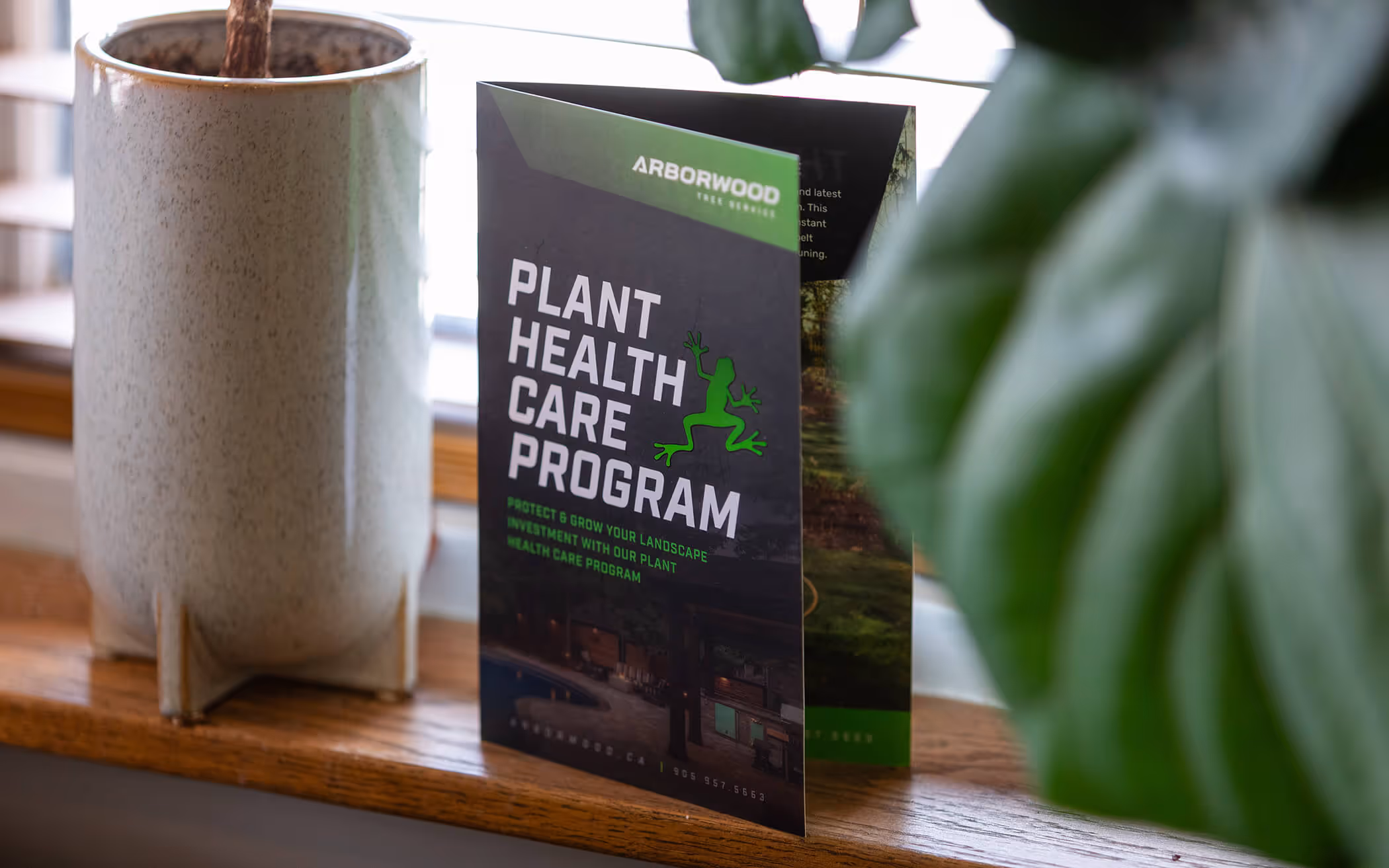
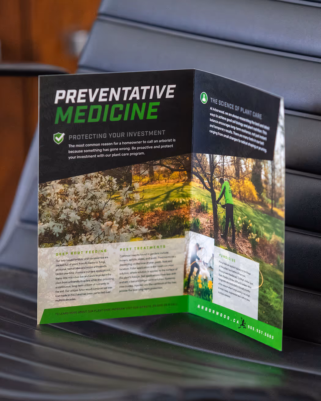
Arborwood also connects with clients and potential employees through print pieces and magazine publications. We’ve designed a range of ads and printed materials to communicate and consistently present the revised branding.
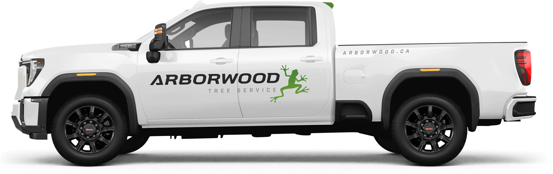
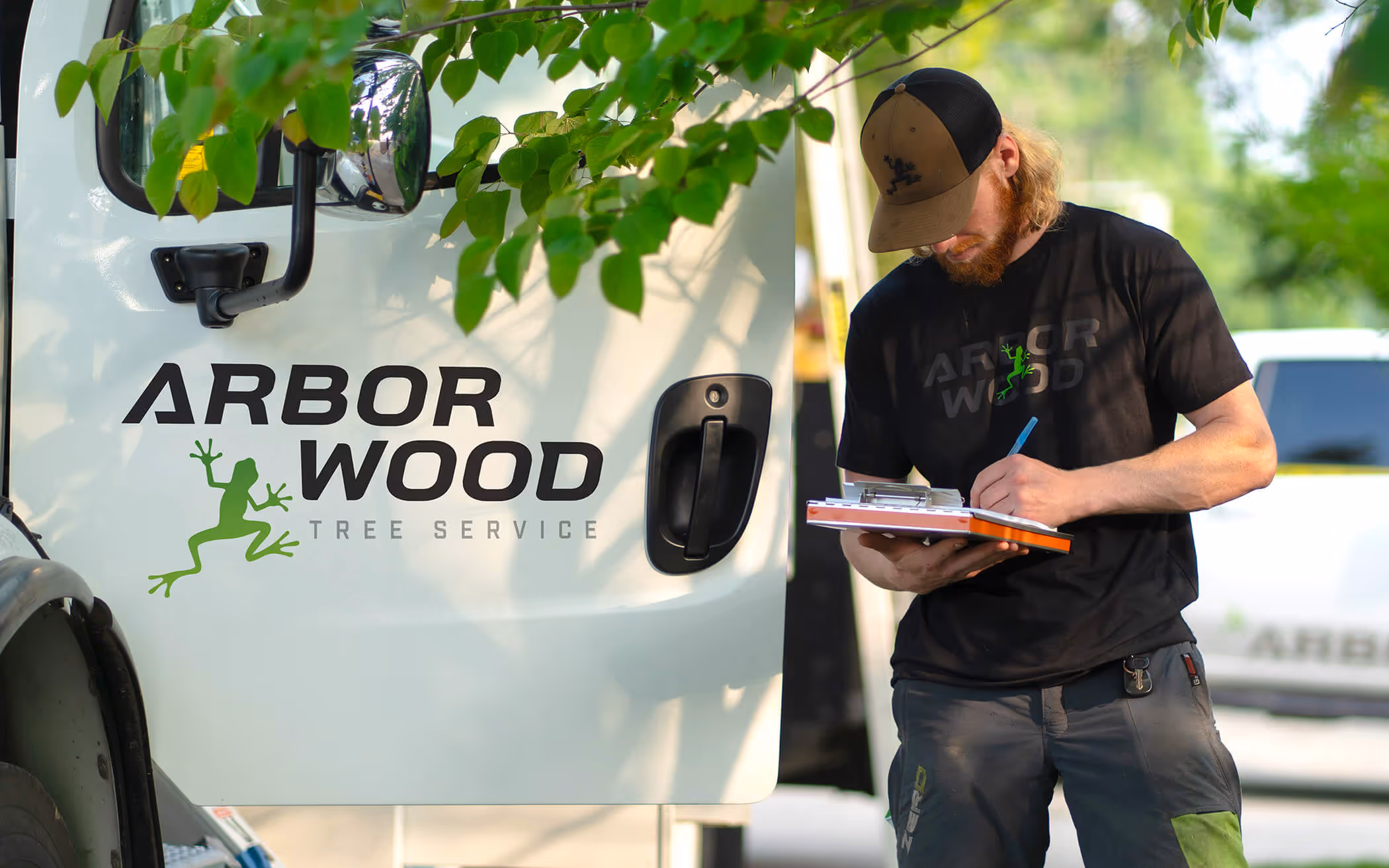
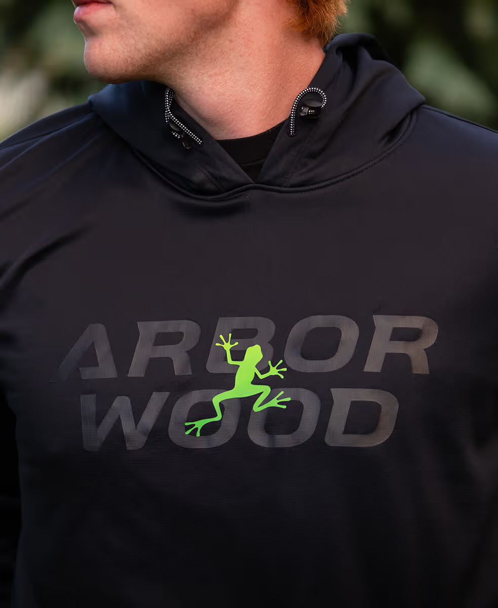
It was important to Arborwood to provide clothing that prioritized safety while also giving employees something they could be proud to wear. The various logo arrangements allowed us to create distinctive designs that fit each piece. Arborwood spends a lot of time on the road, so vehicle graphics are also an important touchpoint that Capture designed to support a staggered rollout of the new brand.
For more than a decade, our team has guided hundreds of businesses and organizations through branding and rebranding. Our approach explains and breaks down the creative process, bringing clarity and strength to your communication