Redeemer University Case study
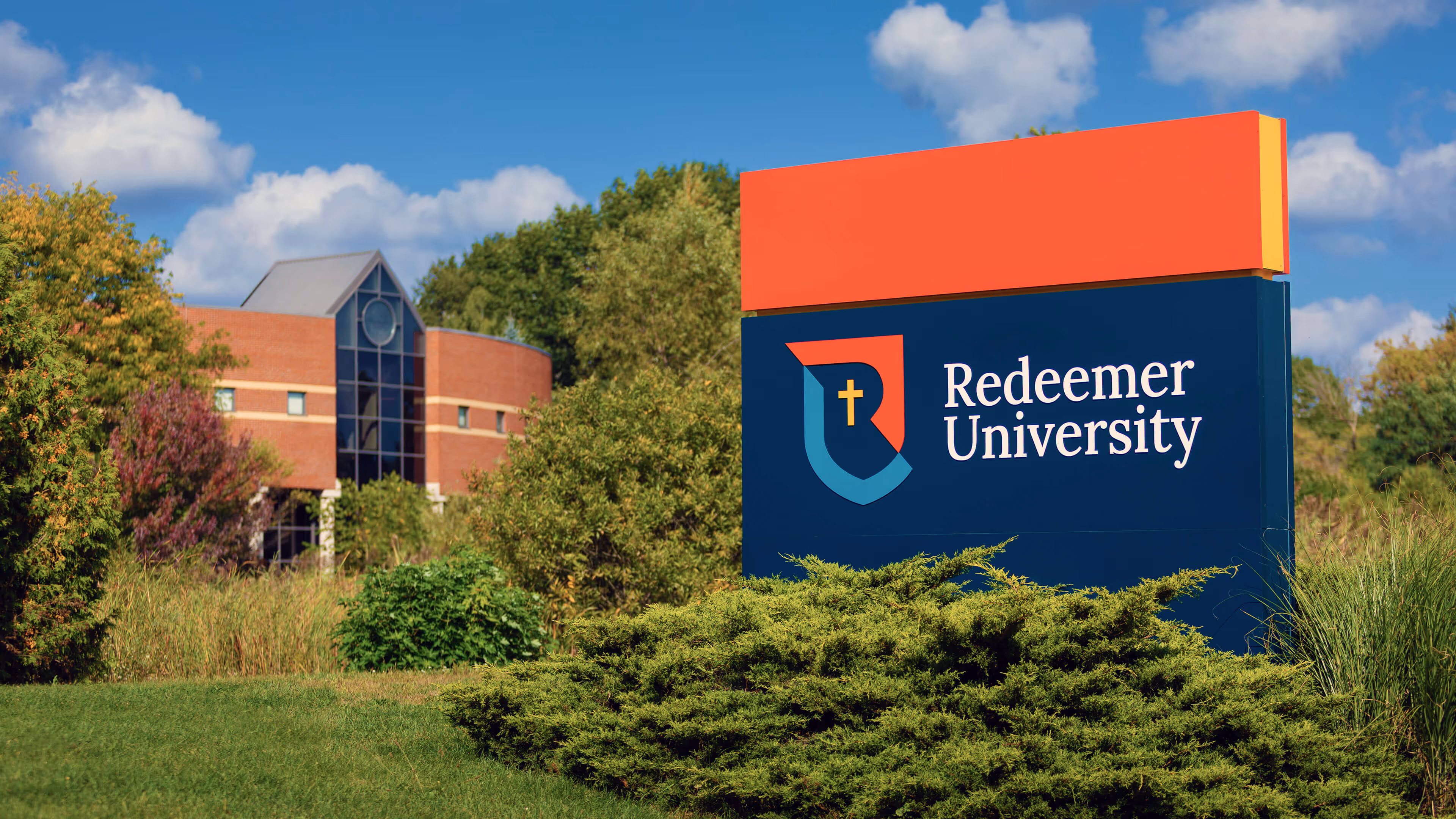
Redeemer University is a private, Christian university located in Ancaster, Ontario. Founded in the 1980s as Redeemer College, it has grown significantly over the past four decades. Following a period as Redeemer University College, the institution received approval to adopt the name Redeemer University in 2020, prompting a rebrand to refresh its look and celebrate this milestone.
As Redeemer embraced new growth and mapped out its future through a strategic plan, Capture was asked to create a brand that honours its heritage while revitalizing its visual identity.
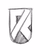


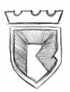
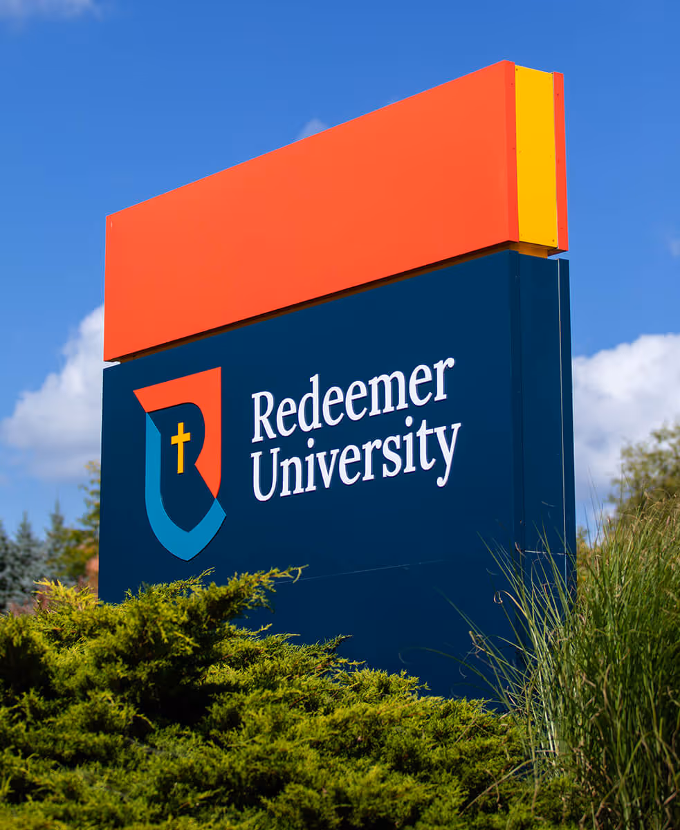
The shield provides a well-understood visual language for an academic institution. The simplicity of the design makes it modern and innovative.


The "shield" provides a well-understood visual language for an academic institution. The simplicity of the design makes it modern and innovative.


At the centre of the logo, the "cross" makes Redeemer’s Christian identity clear and points to its Reformed Christian tradition.


A prominent "R" forms the negative space inside the icon making the shield unique to Redeemer and more identifiable when used on its own.


A "U" is formed by a slice and shift in the shield, emphasizing that Redeemer is a university.
A classic serif typeface balances the modern shield by signalling that the university is established with heritage and tradition. Making the name and designation the same size emphasizes again that Redeemer is a university.


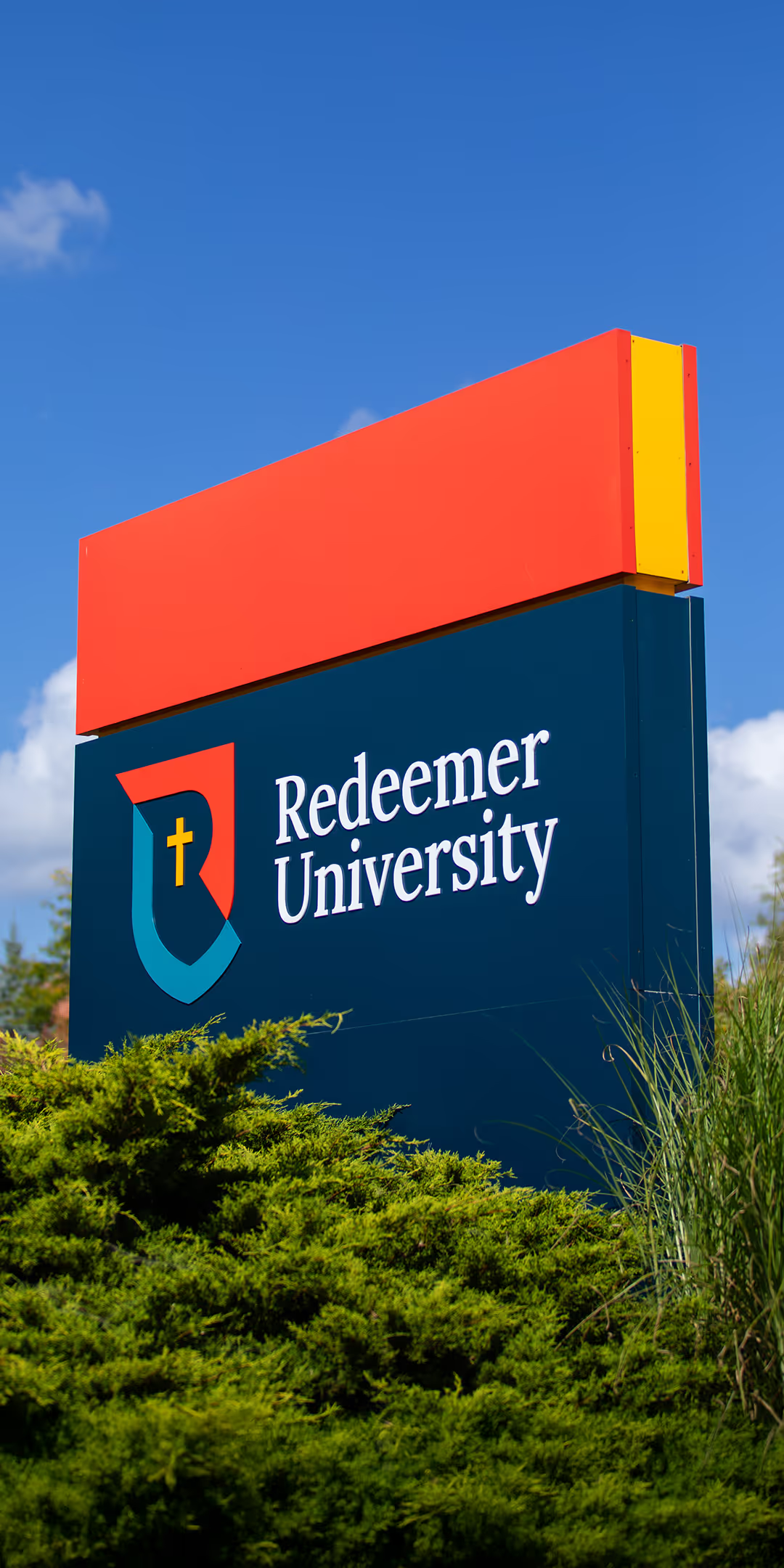
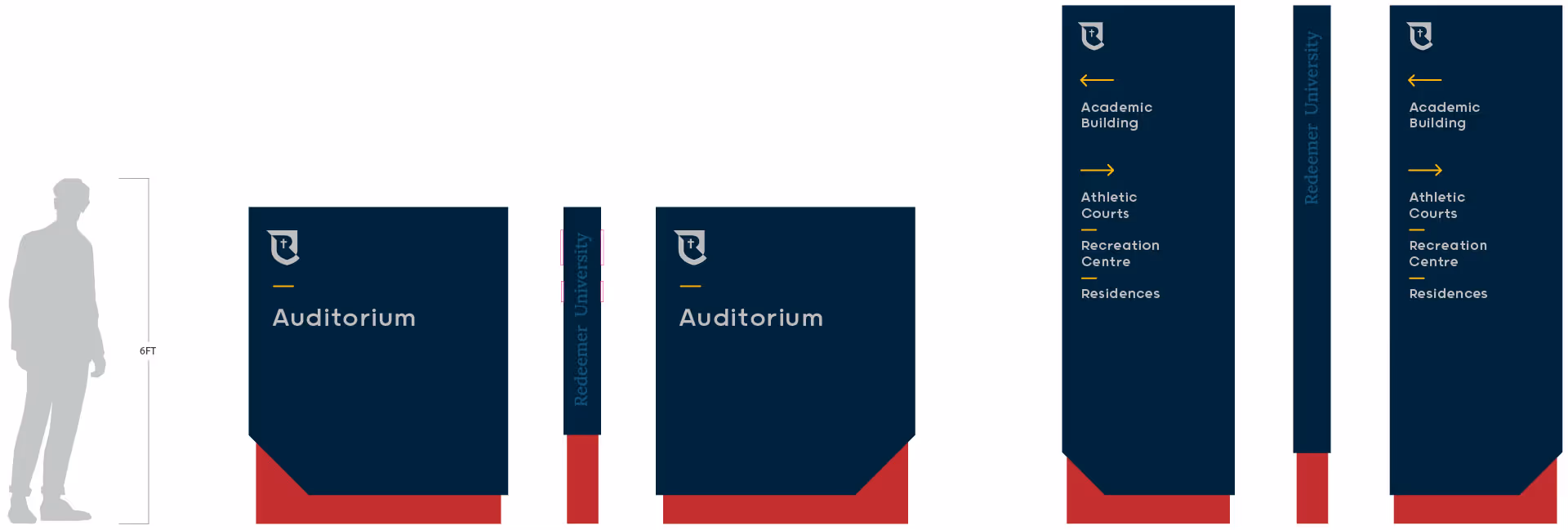
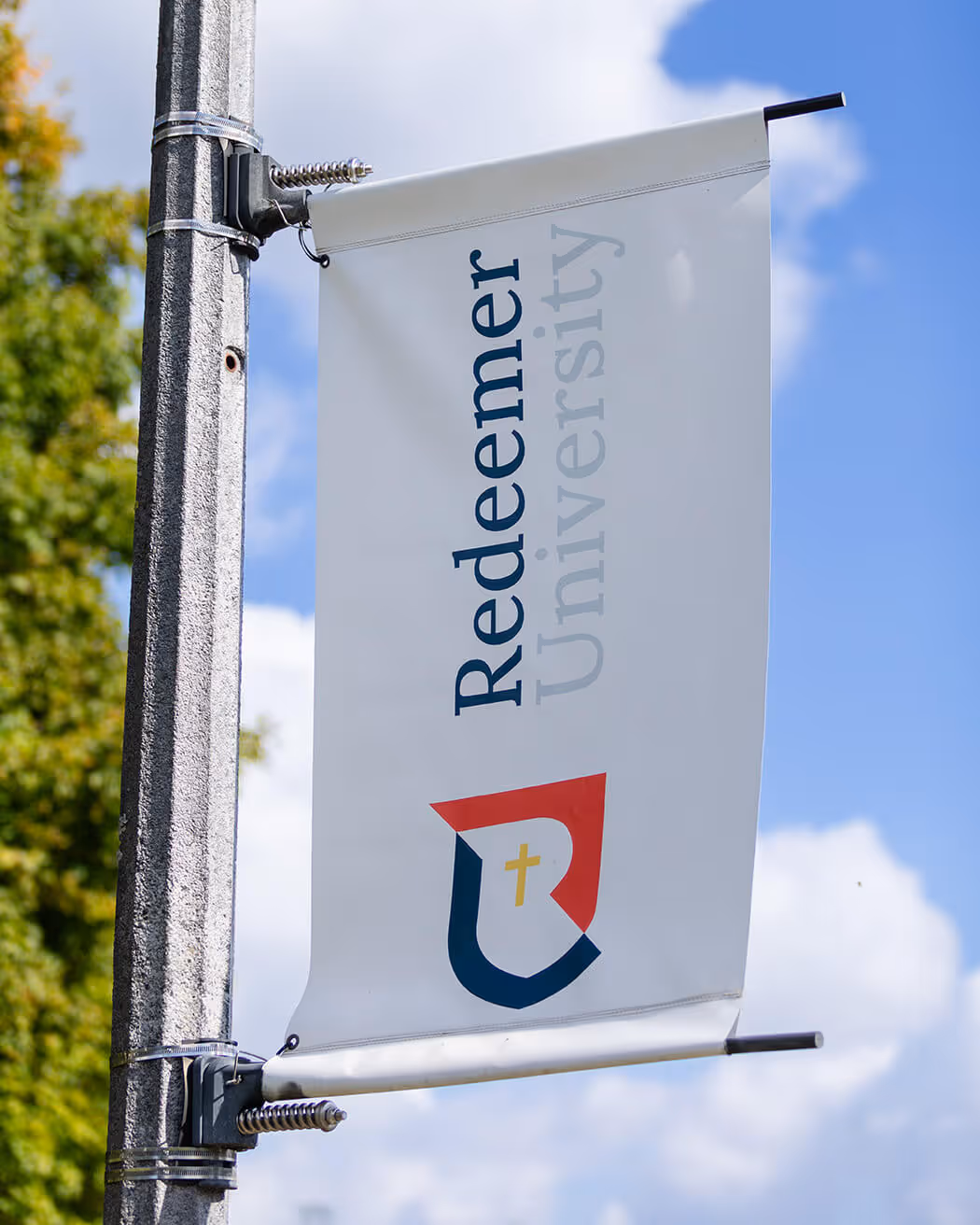
Brightening the red and gold palette from the original logo gives continuity to the brand while the addition of navy blue, gray and a second tone of red provides visual dimension and modernity.

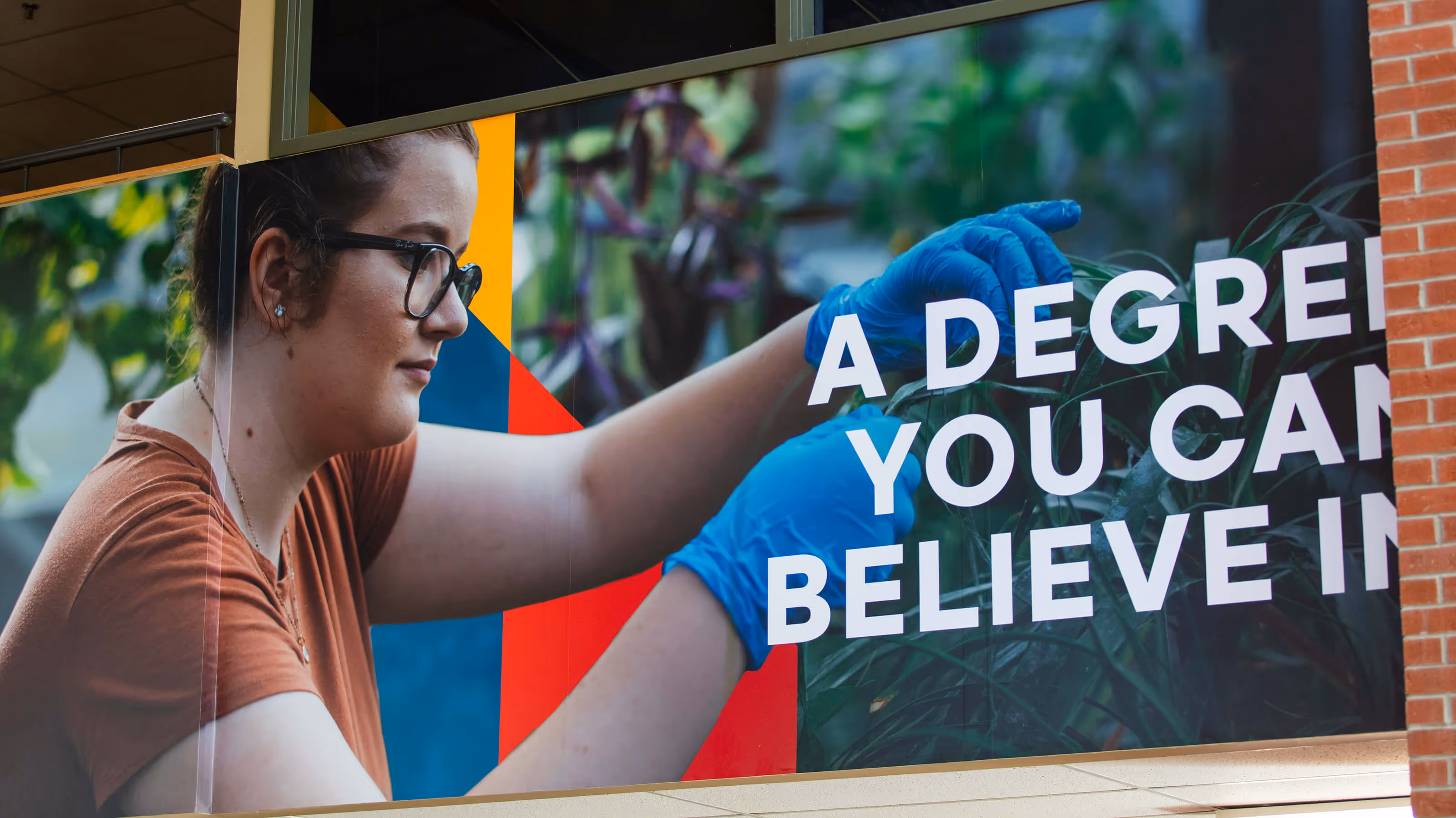
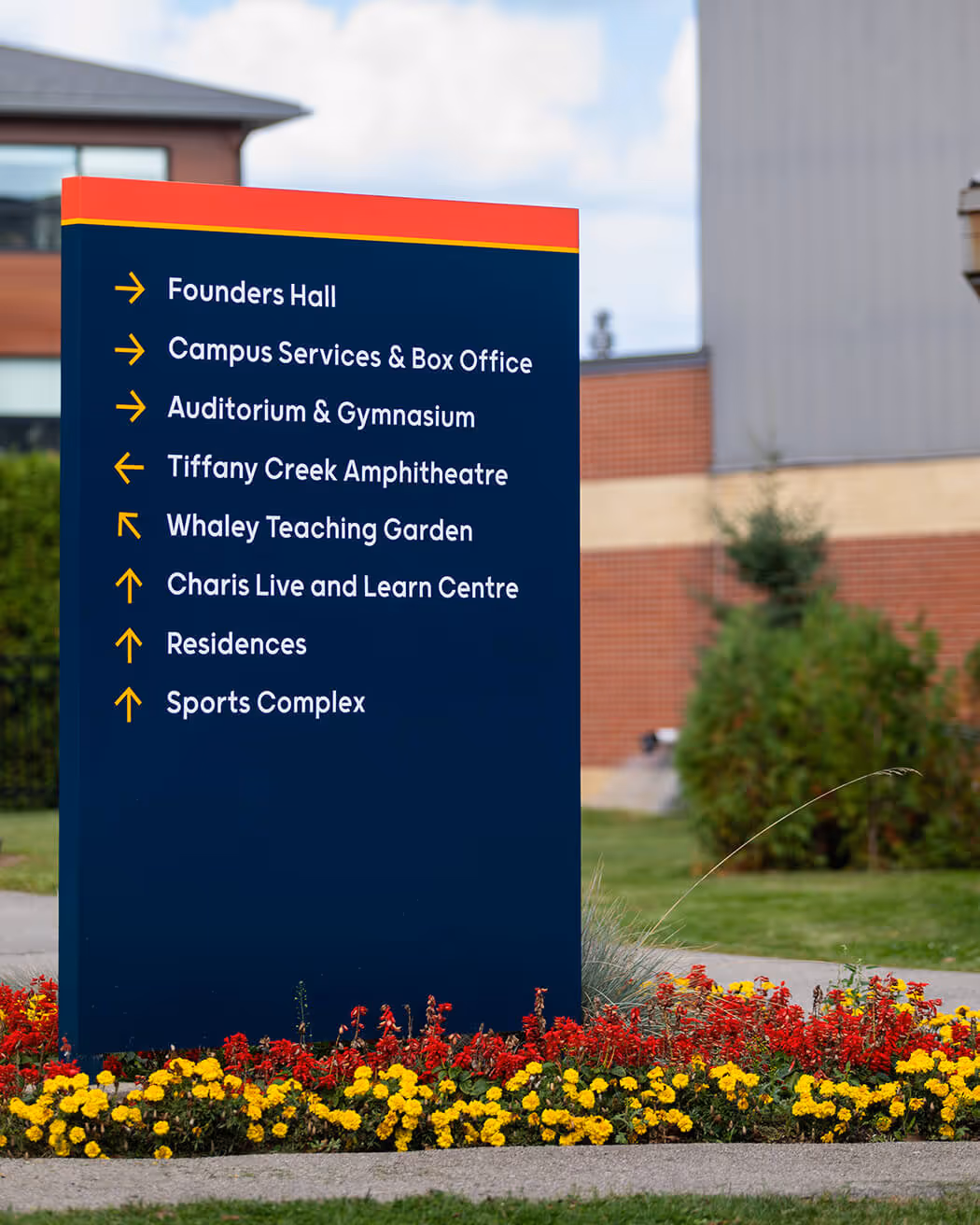
Redeemer University serves a diverse audience, from students and faculty to donors and staff. The brand needed to be versatile, appealing across all applications and to all groups.


A classic serif typeface balances the modern shield by signalling that the university is established with heritage and tradition. Making the name and designation the same size emphasizes again that Redeemer is a university.
Brightening the red and gold palette from the original logo gives continuity to the brand while the addition of navy blue, gray and a second tone of red provides visual dimension and modernity.
Redeemer University serves a diverse audience, from students and faculty to donors and staff. The brand needed to be versatile, appealing across all applications and to all groups.


Capture is the real deal for brand identity design across industry verticals. Their creative eye for aesthetics strengthened the entire brand system, bringing the identity to life across campus and communications.

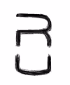
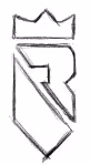
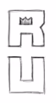
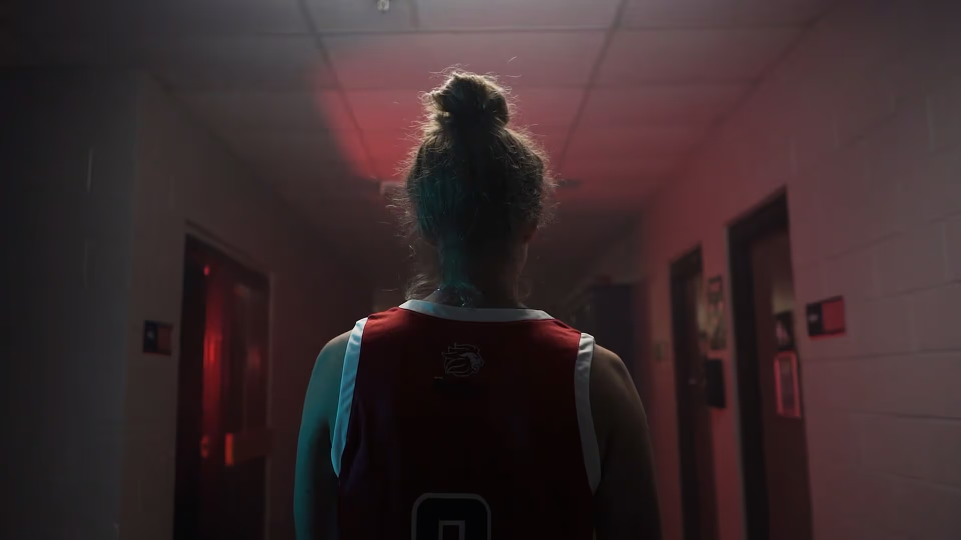
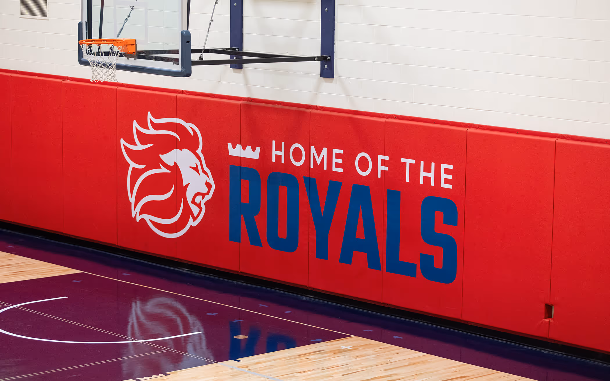
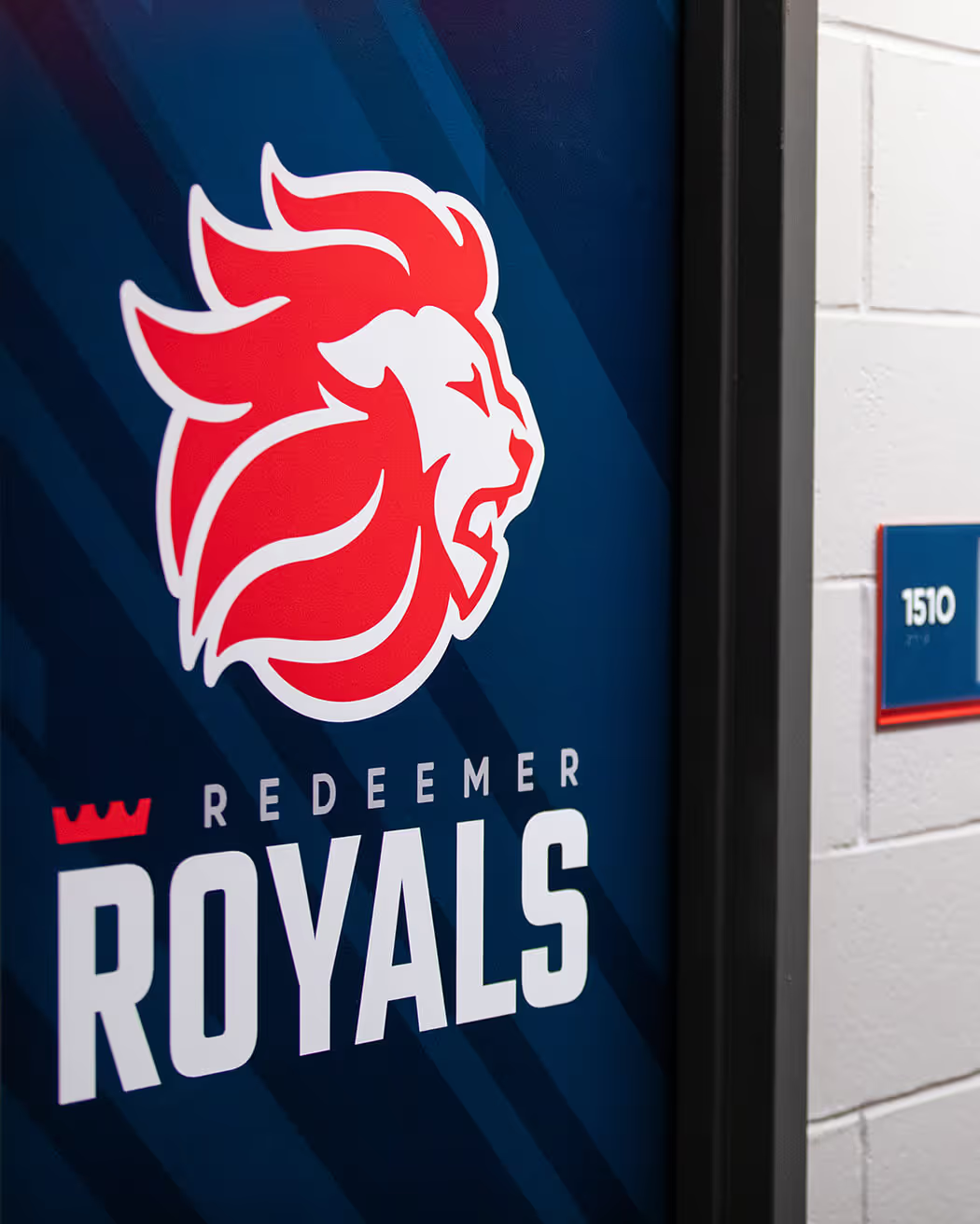
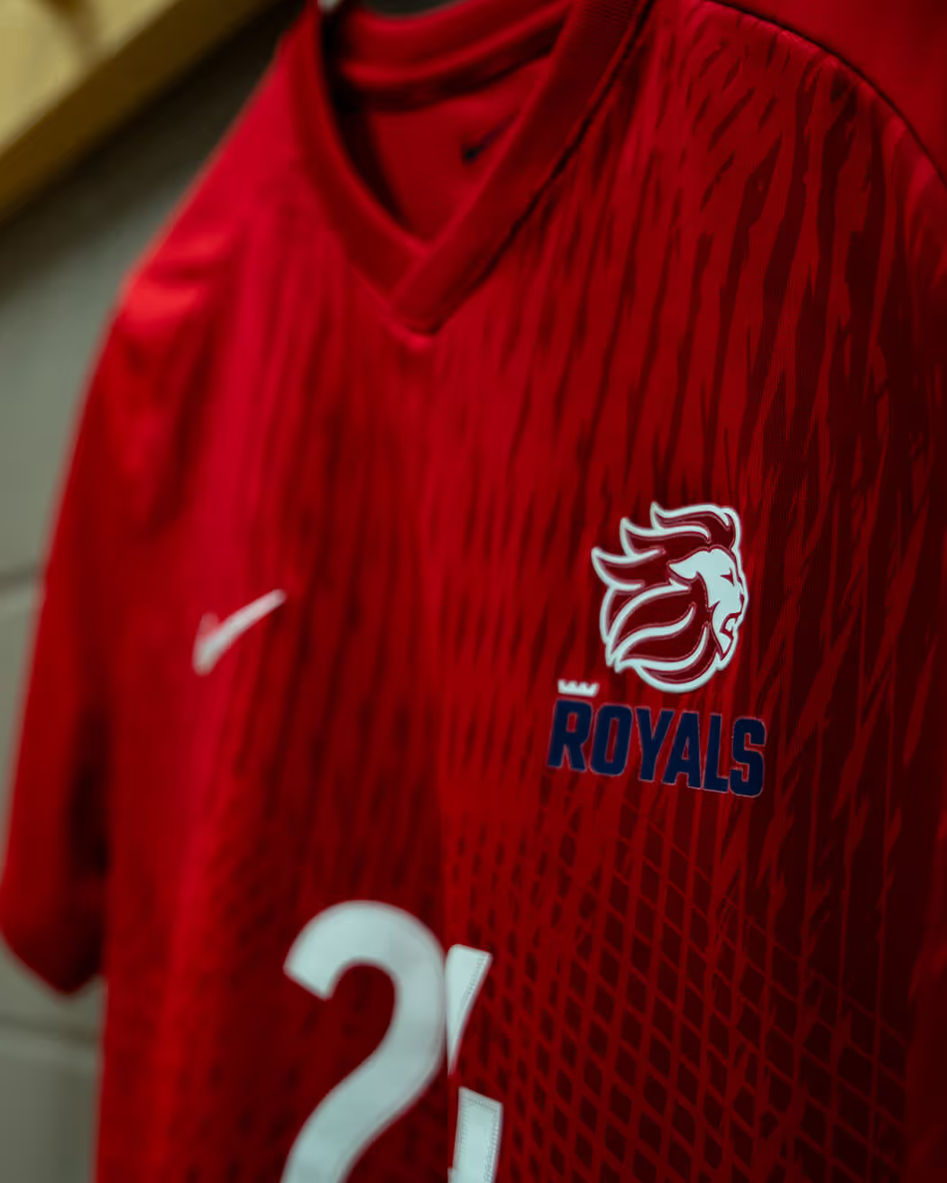
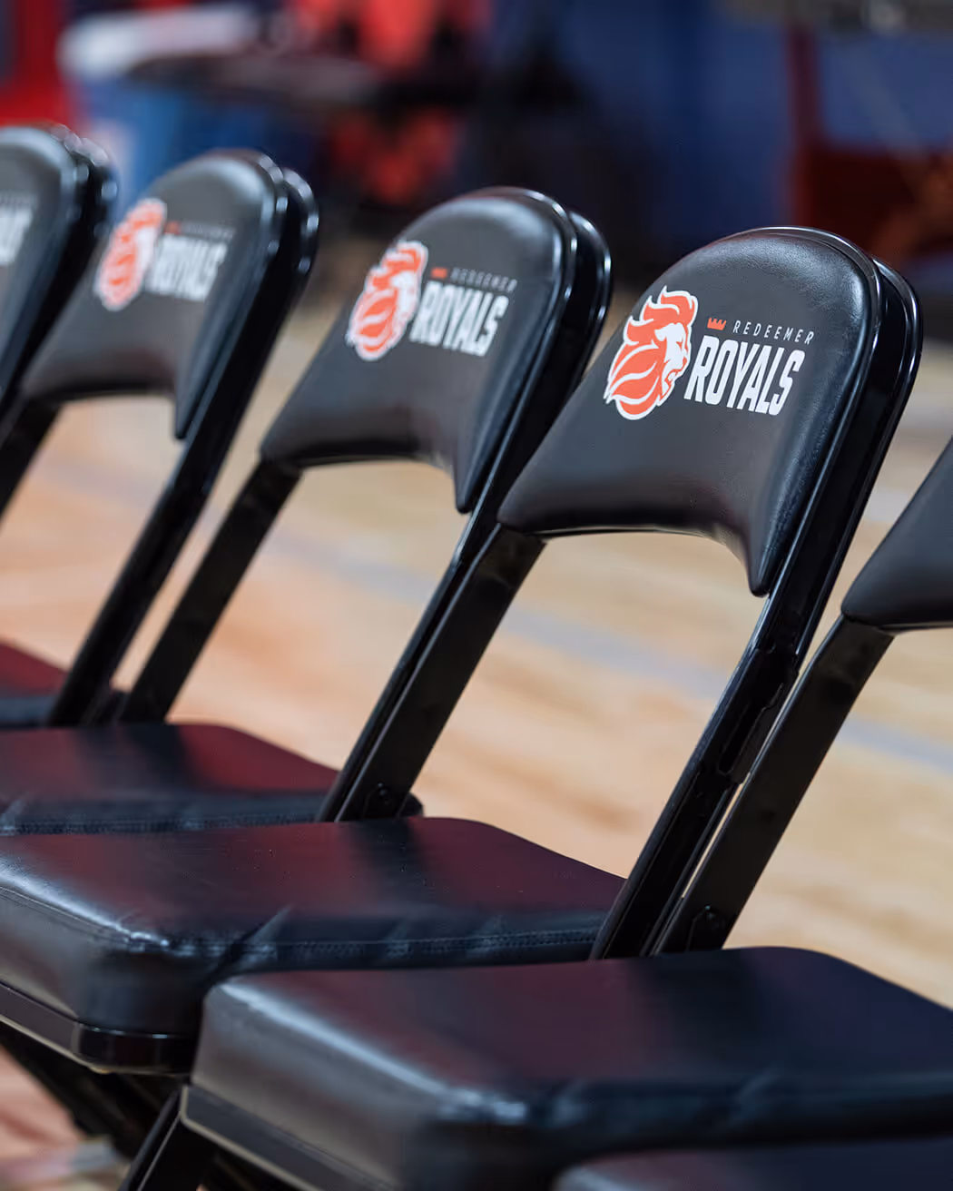
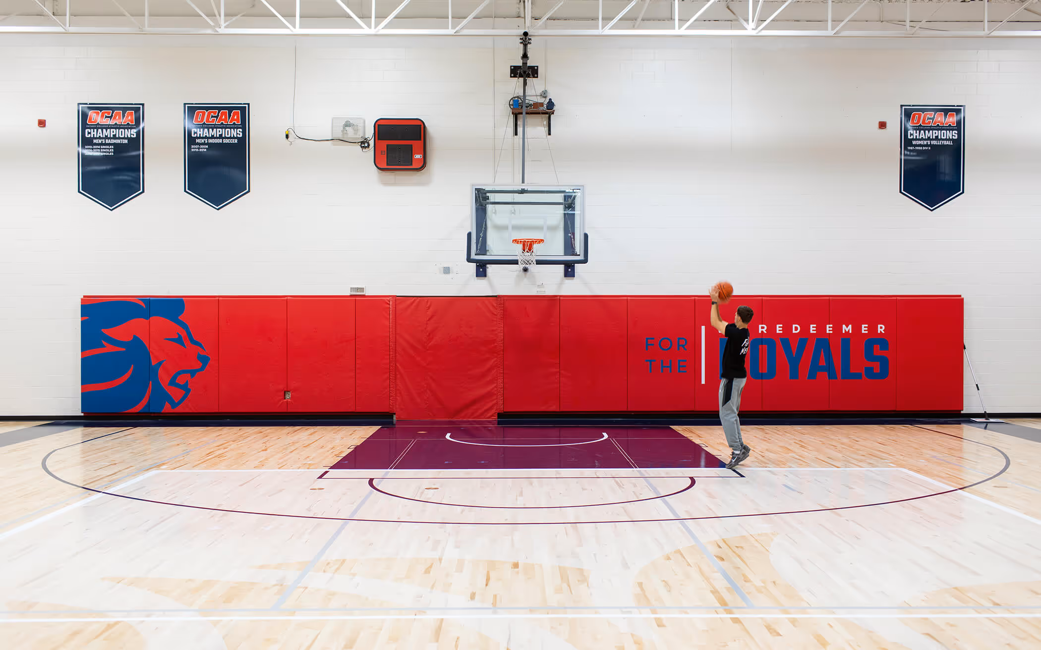
An updated lion mascot was created to give the Redeemer Royals team a clean, mature, and more established icon for jerseys, sweatshirts, and other merchandise. The iconic crown above the “R” in Royals adds brand versatility, giving the athletic department a distinctive element to work with inside of the larger rebrand.


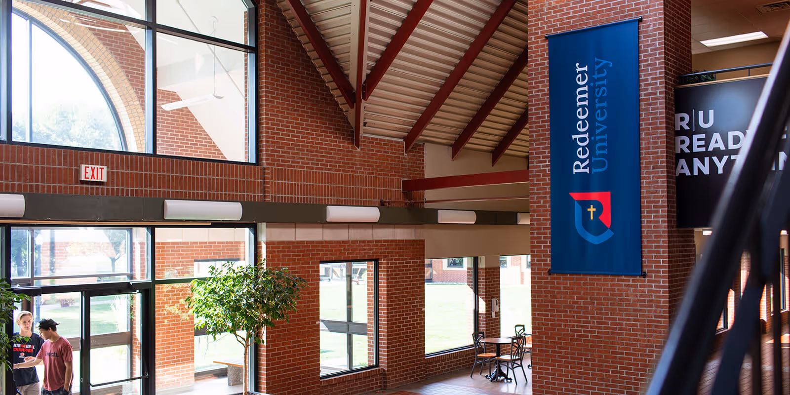
The Resound magazine publication is another important touchpoint for the University, sharing stories about Redeemer’s impact with alumni, parents, supporters, and students. Following the rebrand, the masthead was updated to align with the new brand identity.


For more than a decade, our team has guided hundreds of businesses and organizations through branding and rebranding. Our approach explains and breaks down the creative process, bringing clarity and strength to your communication