The Good Ground Case study

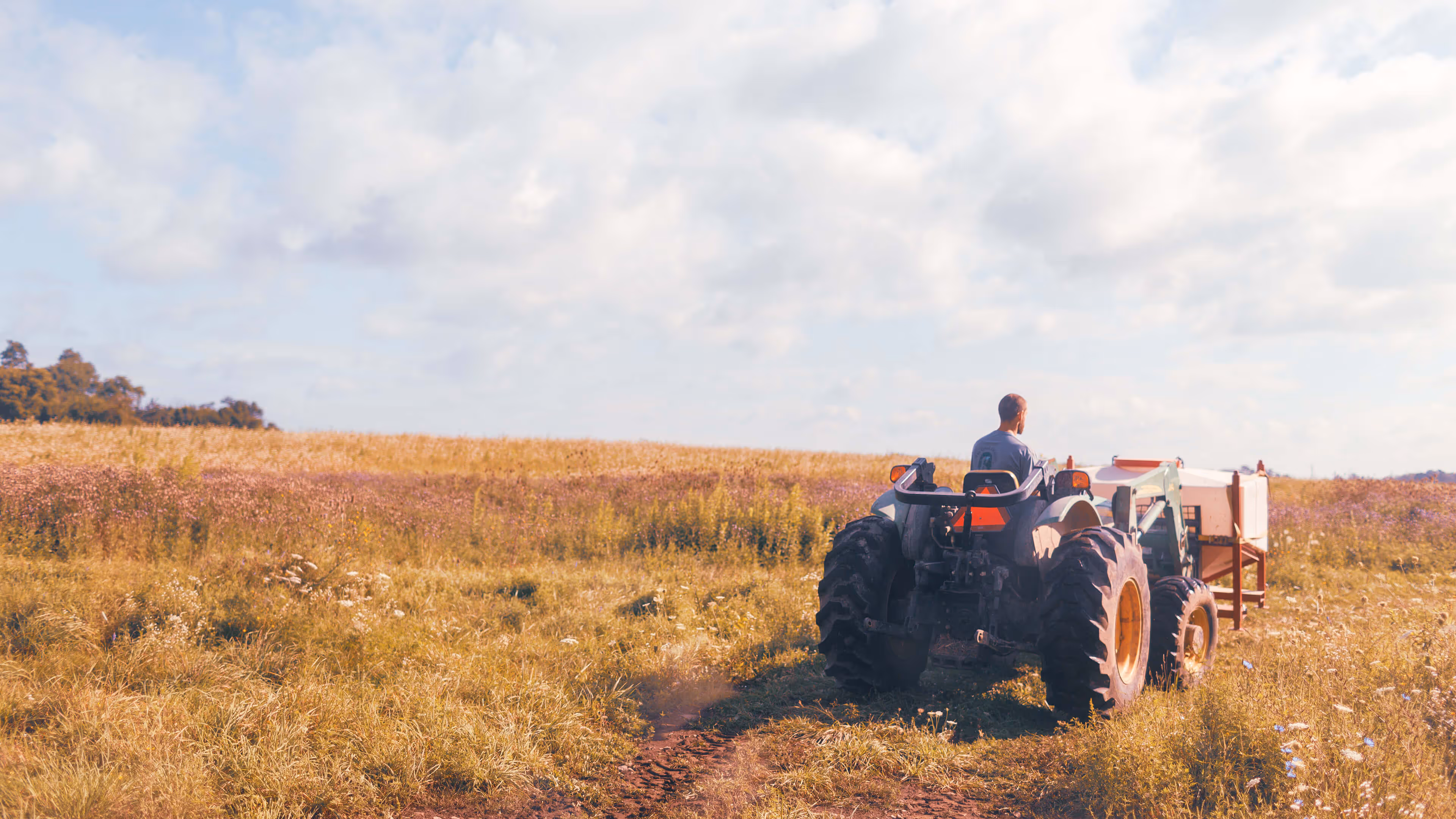
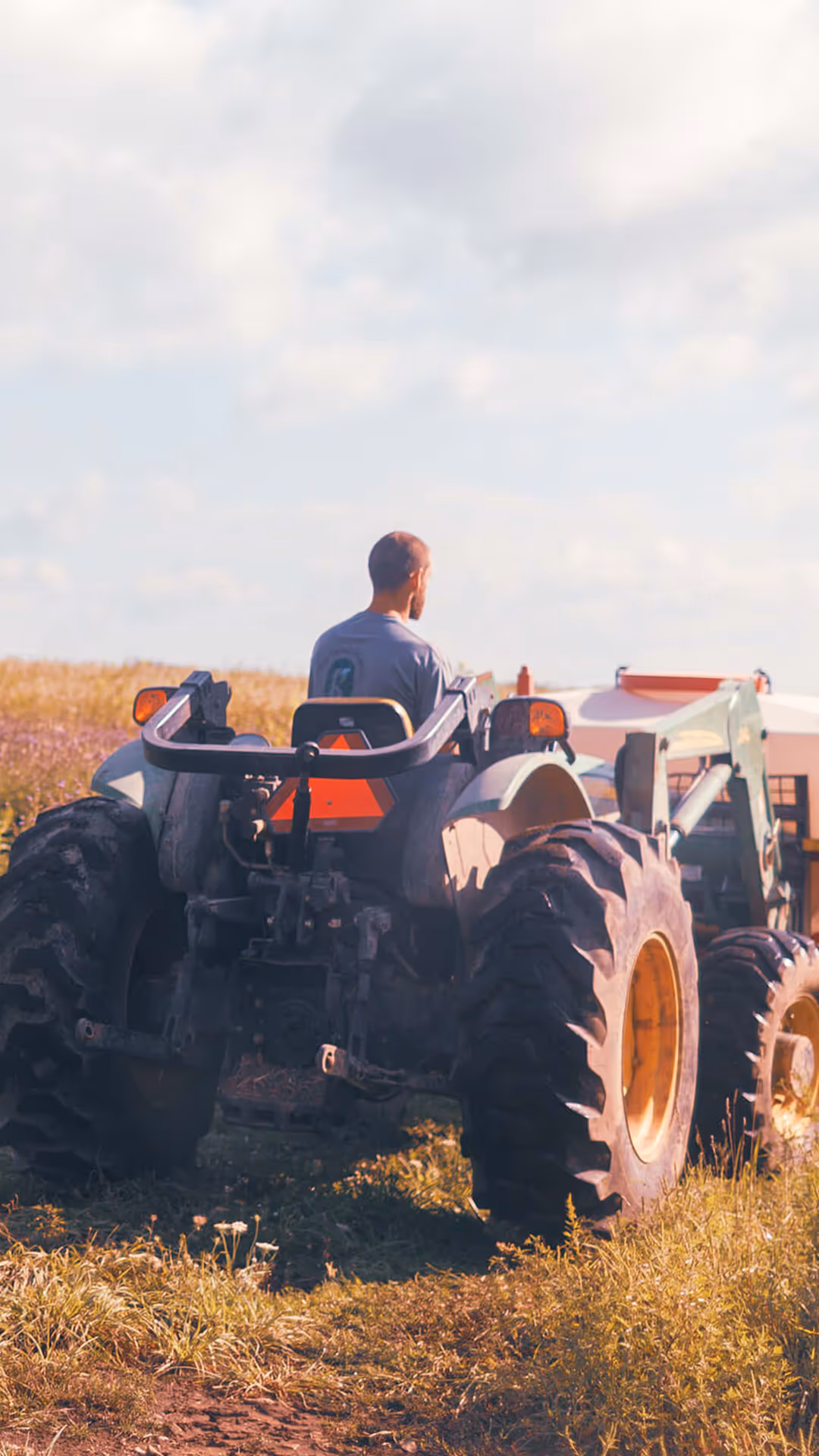
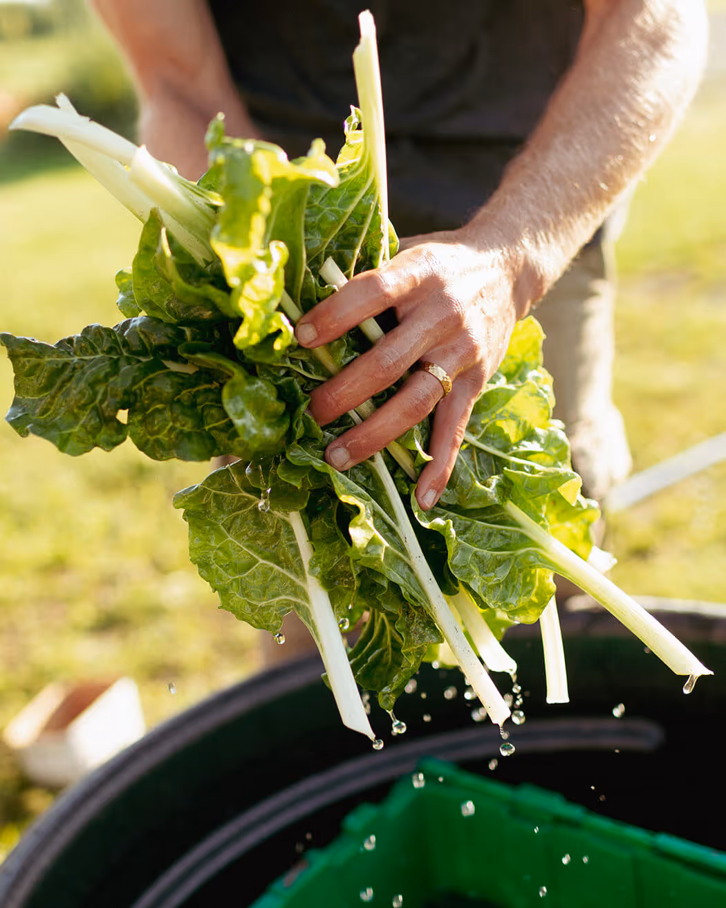
Regenerative agriculture is a re-emerging approach to farming that is focused on responsible, natural practices. Inspired by the delicious possibilities it offered, our client Mike Hutten decided to shift from large-scale chicken production to this very different way of farming. He came to us to help develop and name his new venture, capturing his holistic vision while leaving room for future growth and ideas.
Mike’s farm started small, but he had the vision to grow it into something much bigger. We determined that the name needed to encapsulate many concepts: local community, organic and wholesome food, farming, gardening, vegetables and meat but also other health and lifestyle products for future expansion.

The name we developed hit a number of other key criteria as well, like being memorable and meaningful, and being appropriate but not generic. But for Mike and his farm, it was also more than that.
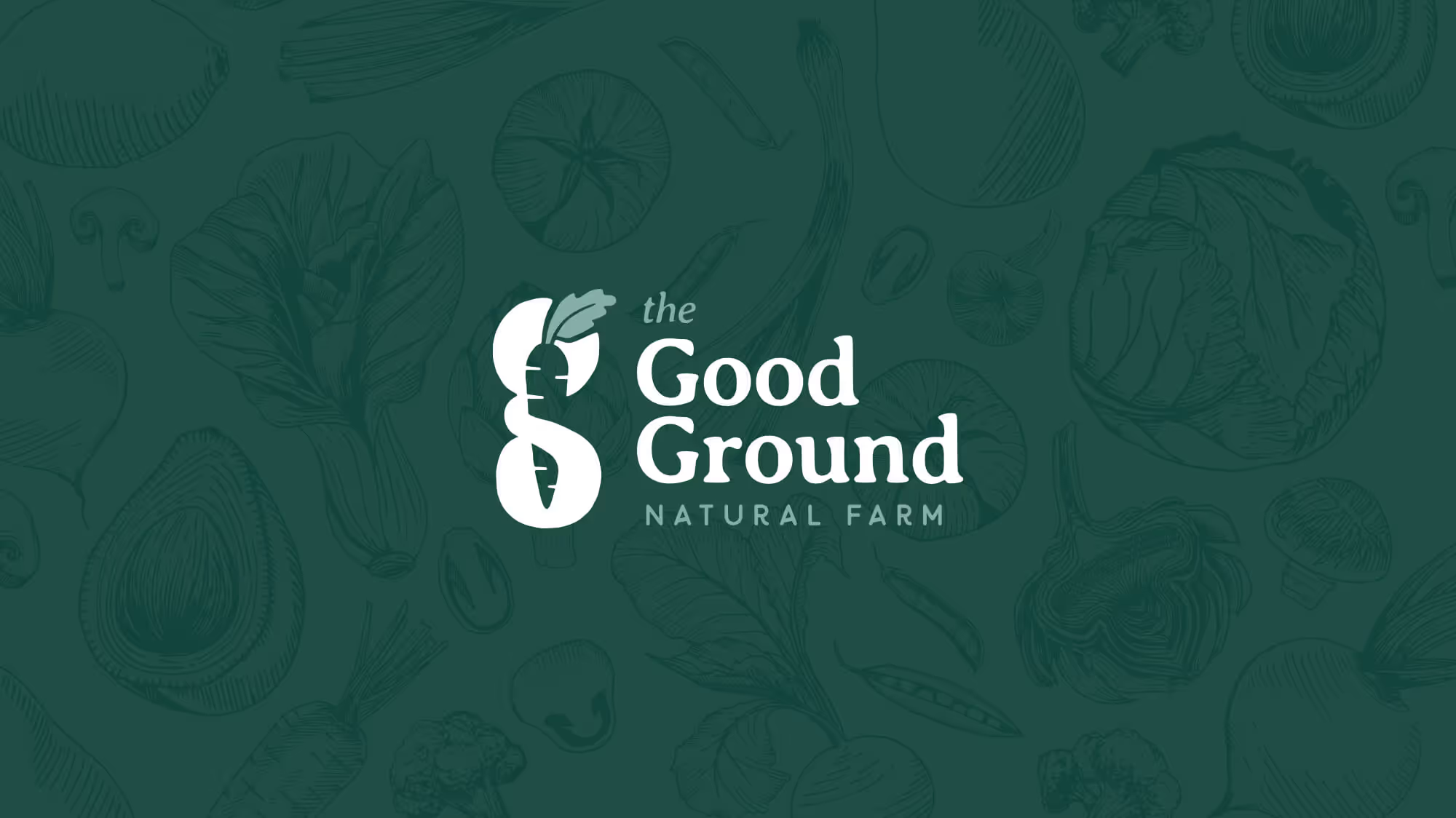
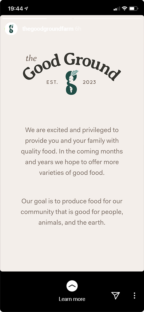
The Good Ground’s new name symbolizes what the farm is all about: infusing the simple goodness of the earth into the food they produce for their neighbours.
All the criteria we used for the naming need to seamlessly translate to the visual identity. This meant choosing colours, typefaces and an icon style that spoke the same language as the name, pushing forward their place in the marketplace.


To help us get the tone and feeling of The Good Ground right, we presented Mike with several moodboards, showing various colour schemes, typefaces and icon styles in conjunction with photography and other design elements. Mike picked the direction that communicated his ideas and tone the best. This moodboard then informed our sketching and design decisions.
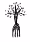
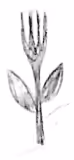
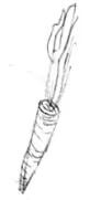
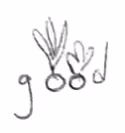
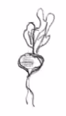
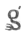
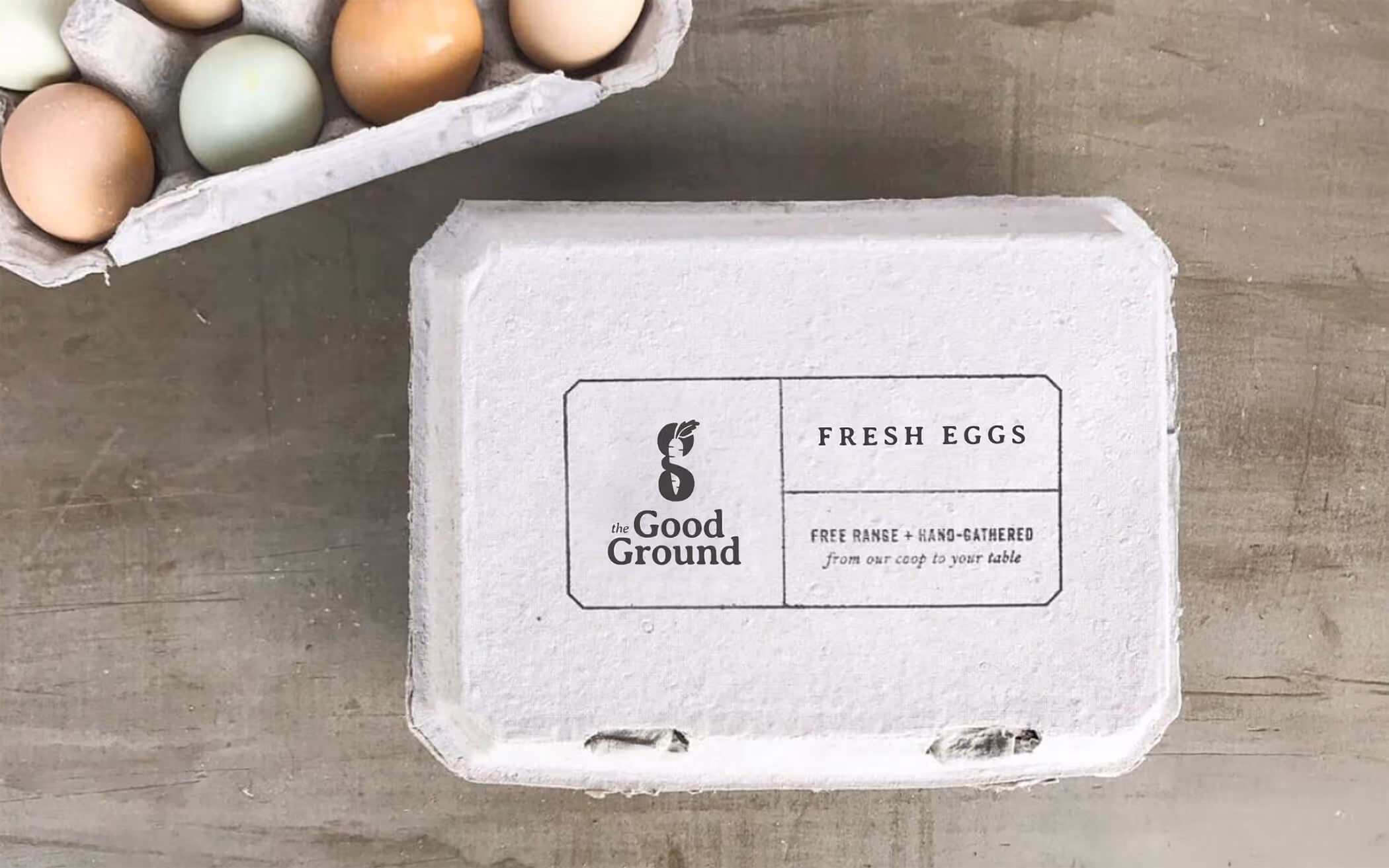
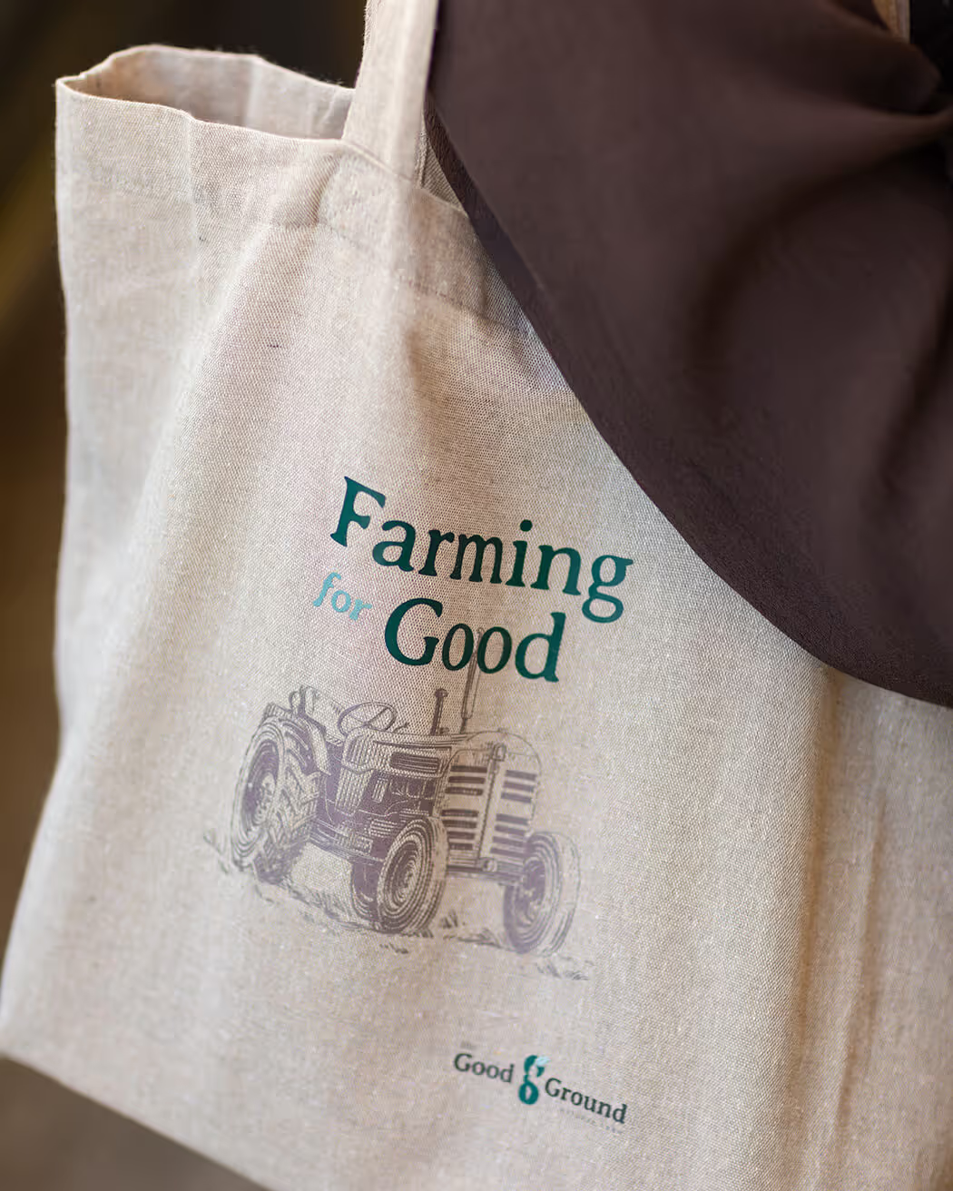
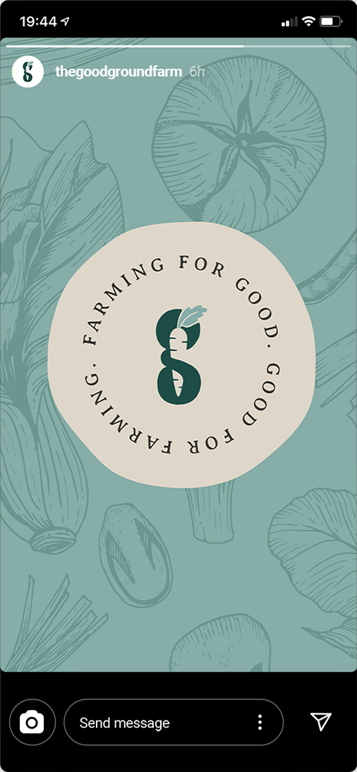
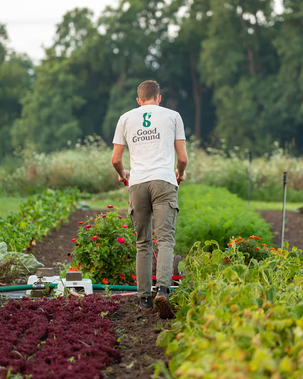
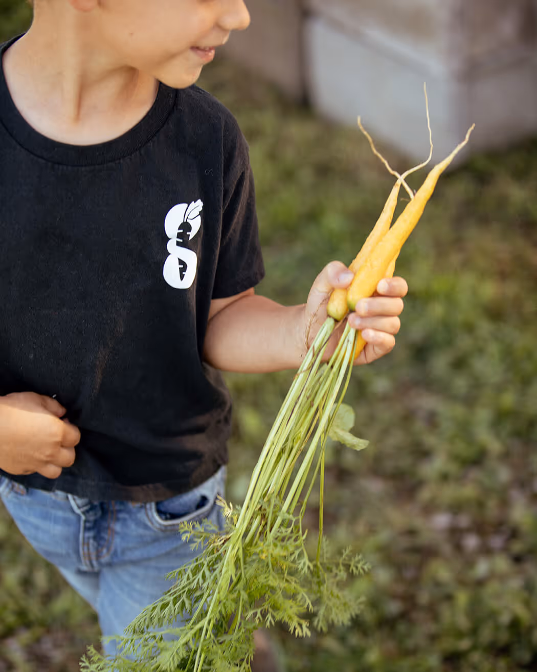
The final logo and branding system uses a carrot, a lowercase G letterform, a soft serif font and a natural secondary typeface to create an appropriate and versatile logo that feels aligned with the simple good food Mike is offering his community.

All the criteria we used for the naming need to seamlessly translate to the visual identity. This meant choosing colours, typefaces and an icon style that spoke the same language as the name, pushing forward their place in the marketplace.
To help us get the tone and feeling of The Good Ground right, we presented Mike with several moodboards, showing various colour schemes, typefaces and icon styles in conjunction with photography and other design elements. Mike picked the direction that communicated his ideas and tone the best. This moodboard then informed our sketching and design decisions.
The final logo and branding system uses a carrot, a lowercase G letterform, a soft serif font and a natural secondary typeface to create an appropriate and versatile logo that feels aligned with the simple, good food Mike is offering his community.


Capture took the time to understand the vision I had for my company, and created a brand identity that expertly captured that vision. They gave me room to critique their designs, and were willing to edit things to make it just right.

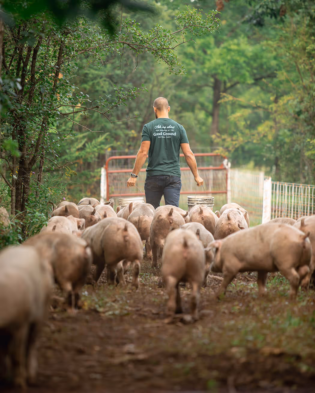
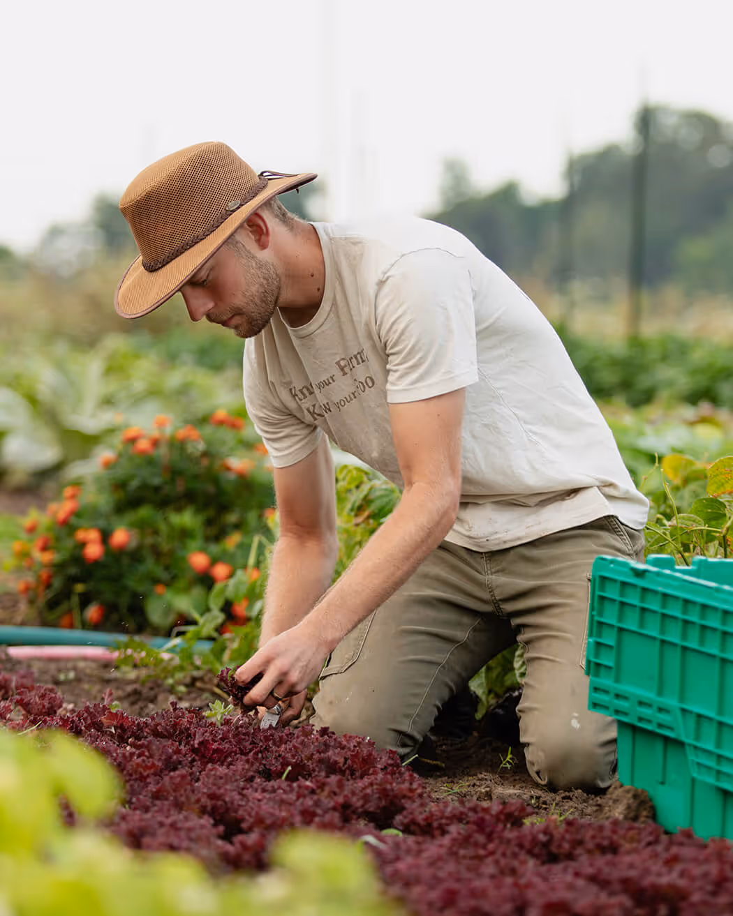
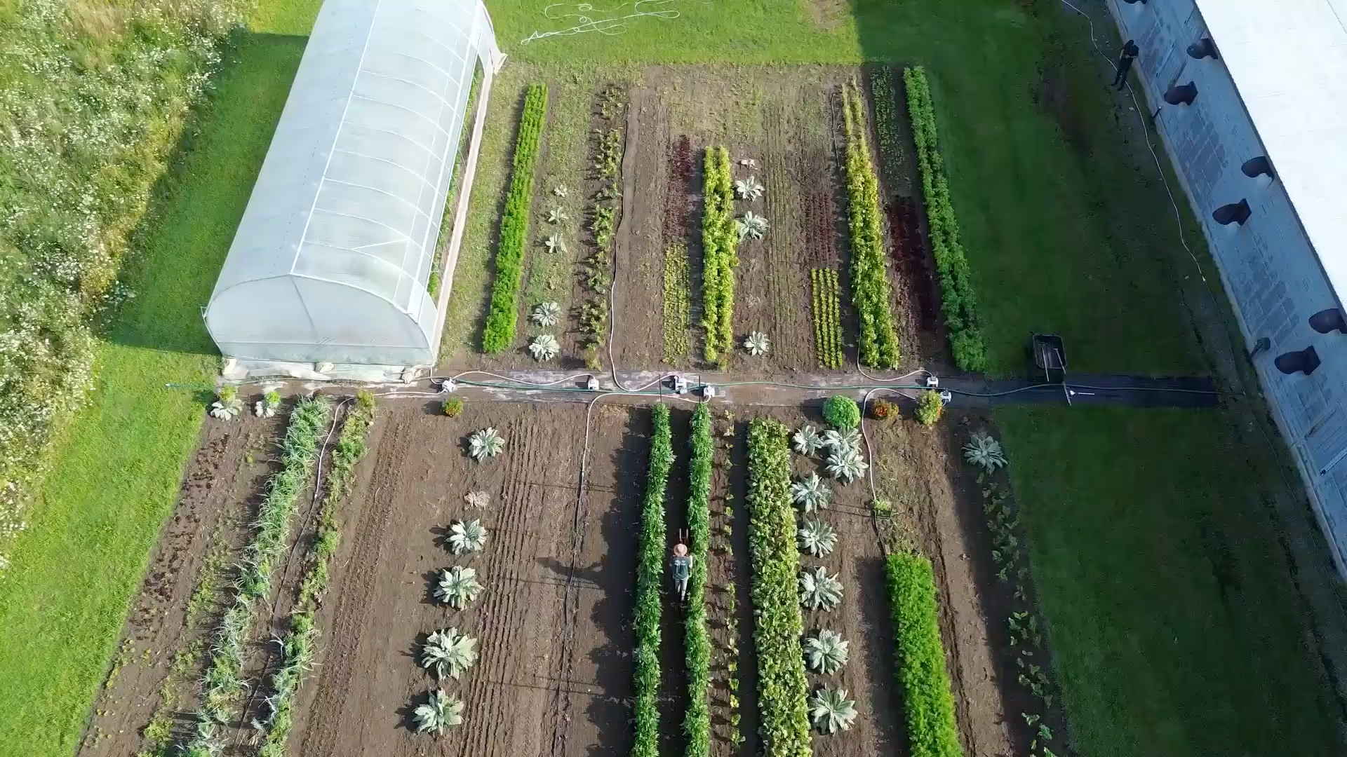
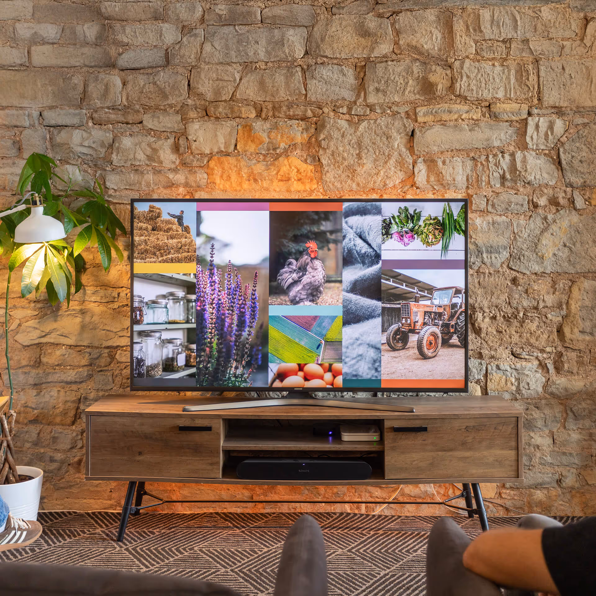
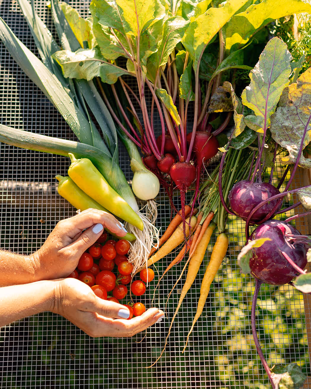
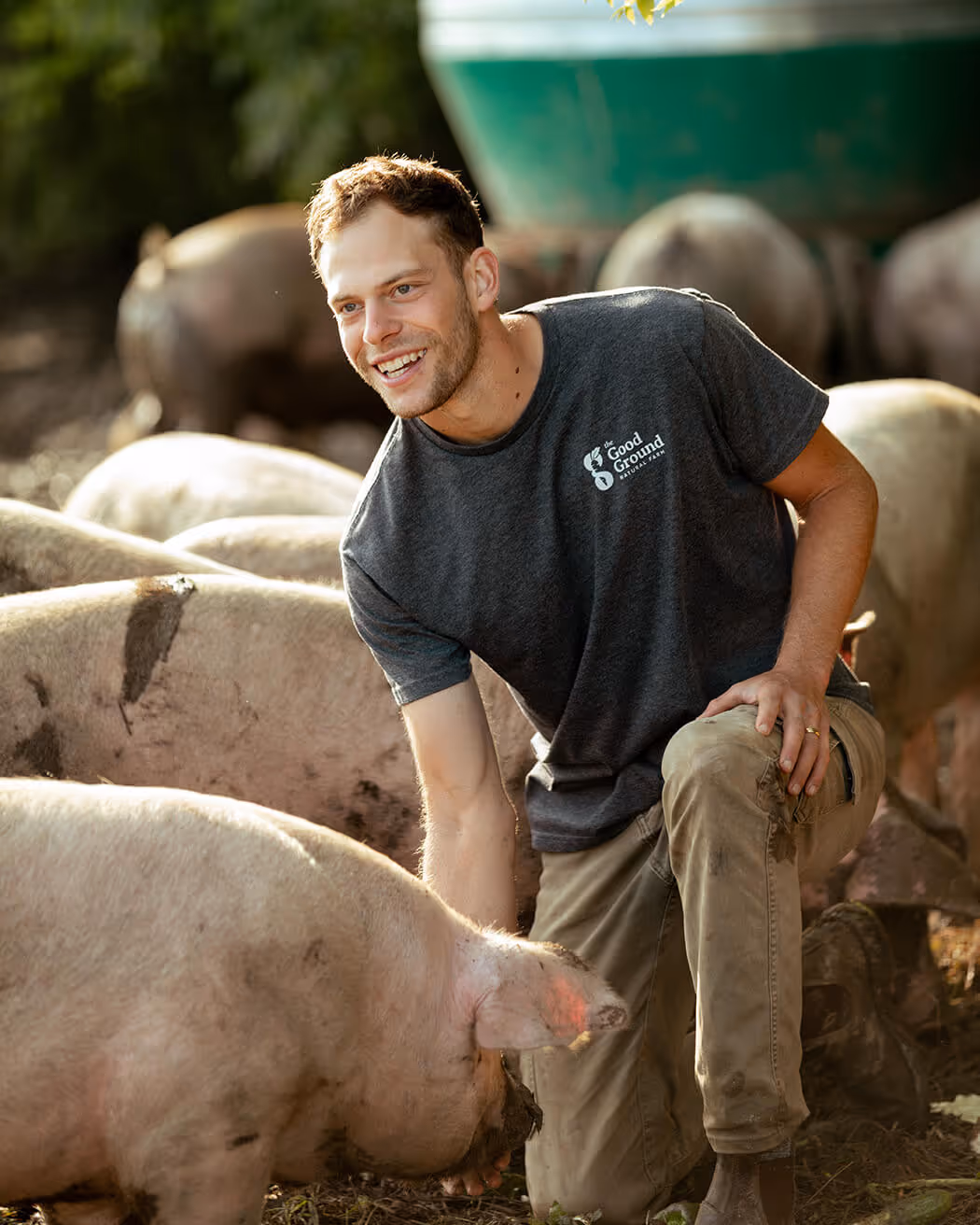
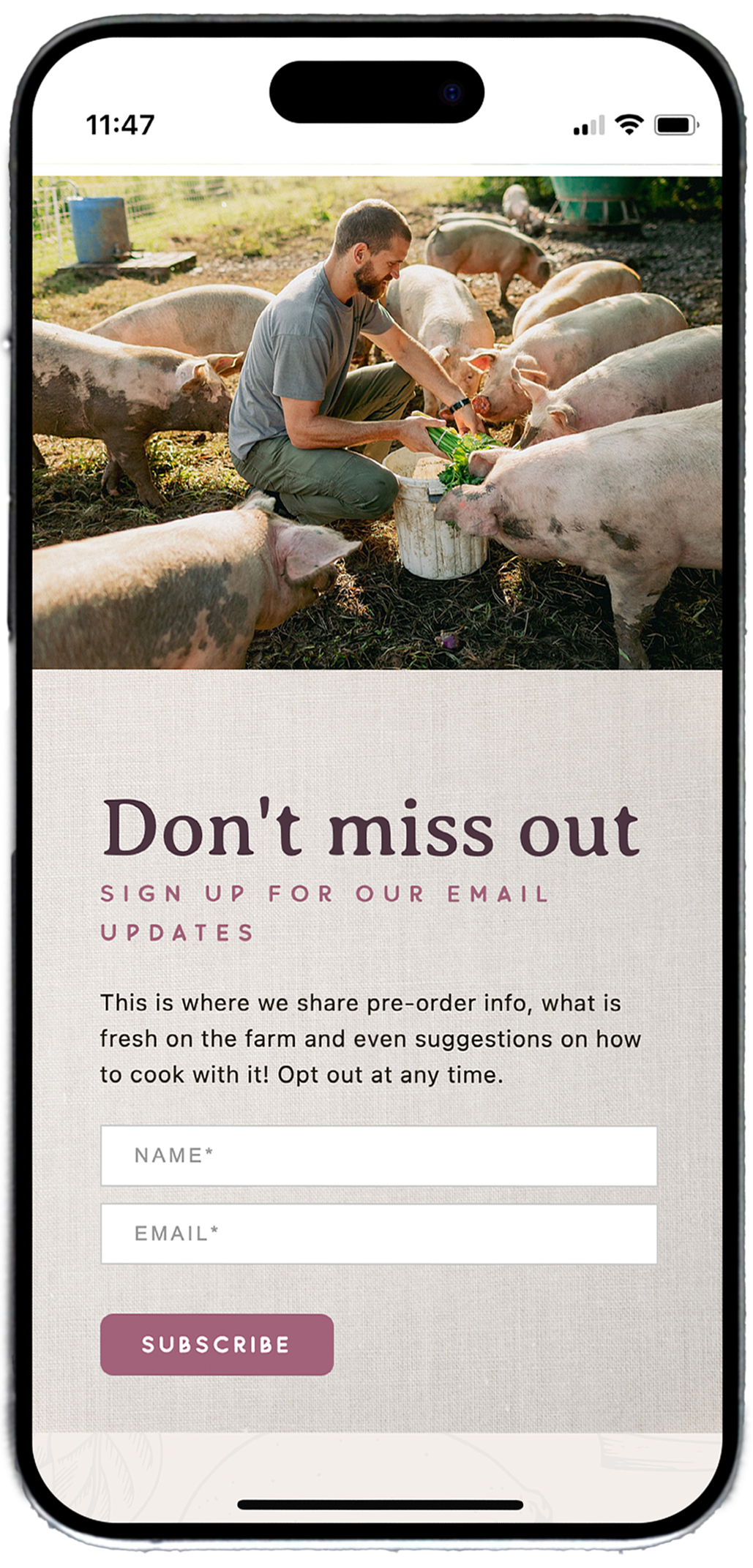
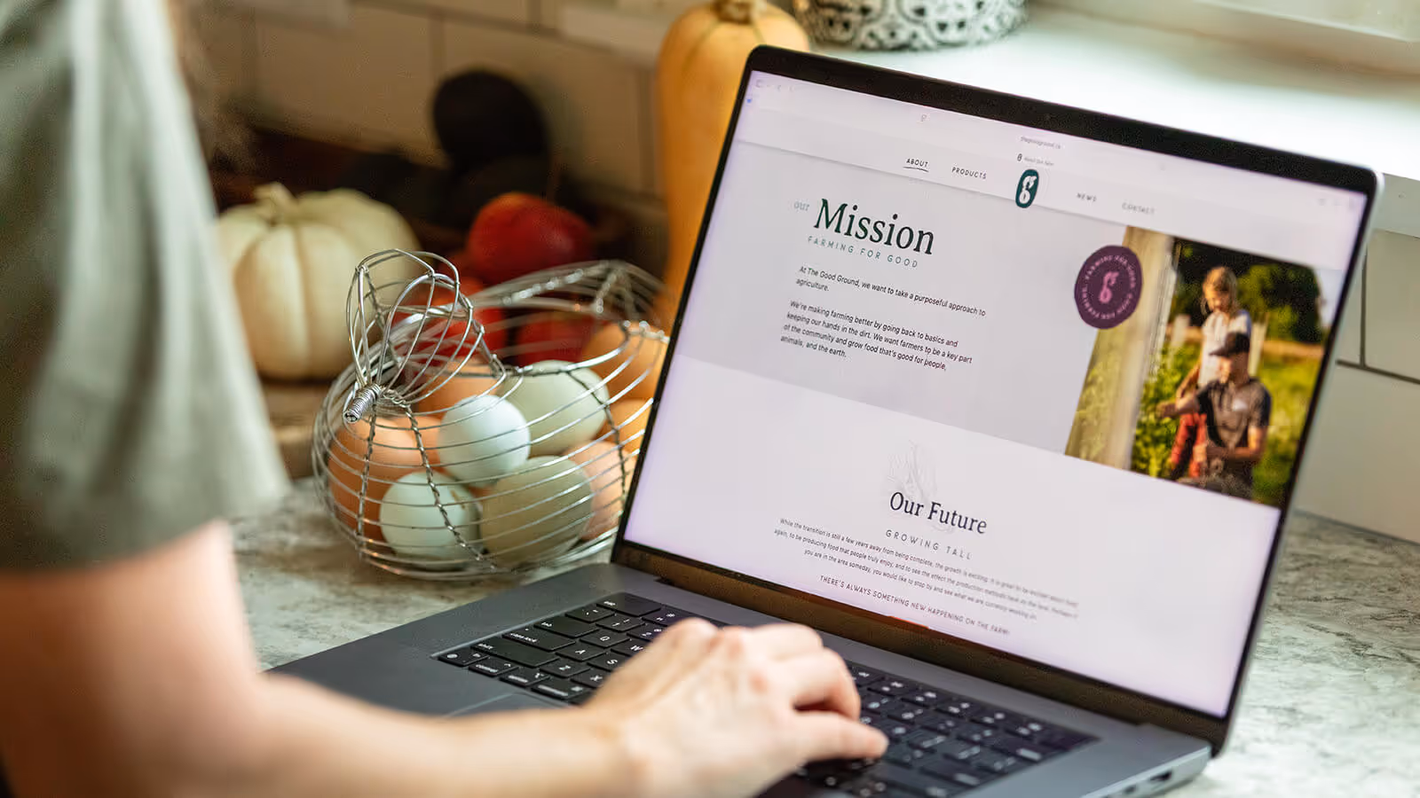
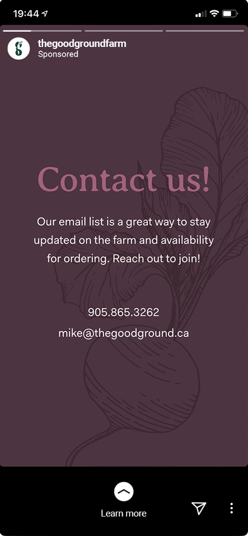
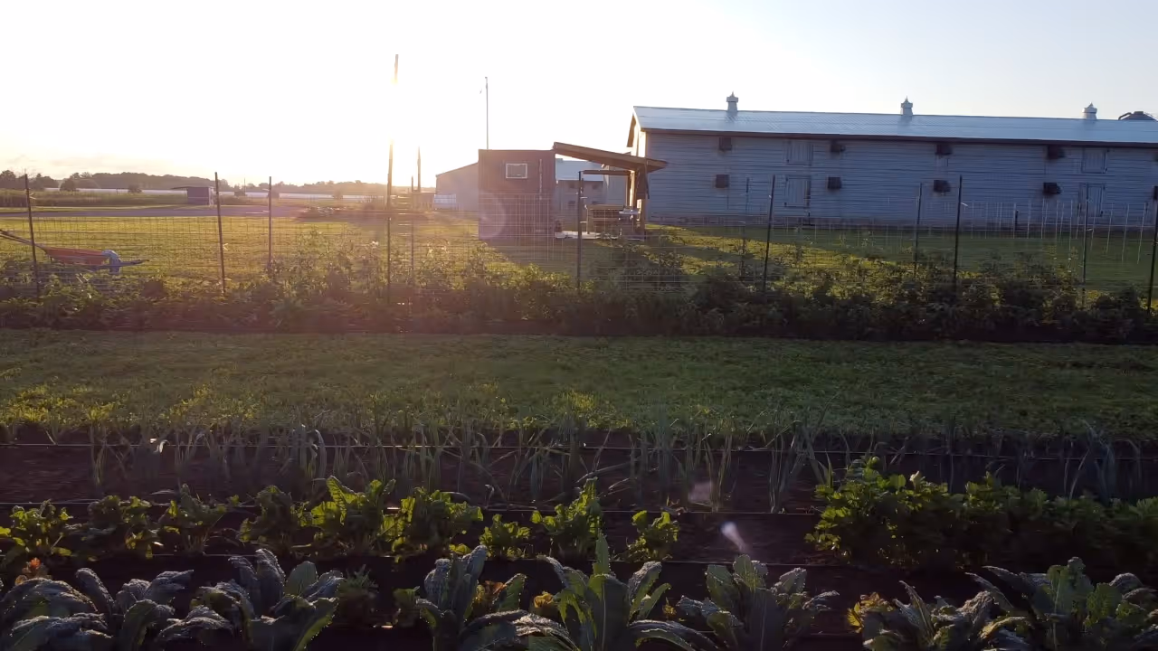
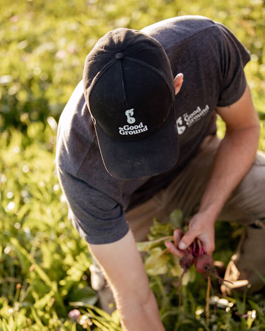
To build their brand and engage their audience, The Good Ground needed a strong online presence. Using photography and drone footage we took for them, we helped them to create compelling social media assets, design and strategize email newsletter templates, and write, design, and program their website to consistently and powerfully tell their story.
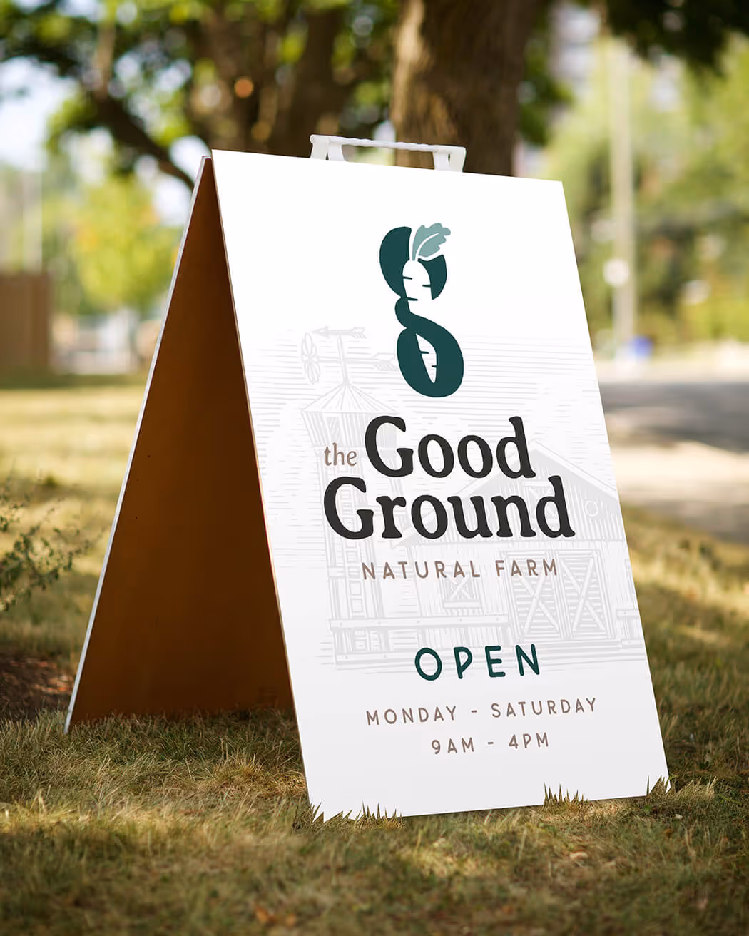
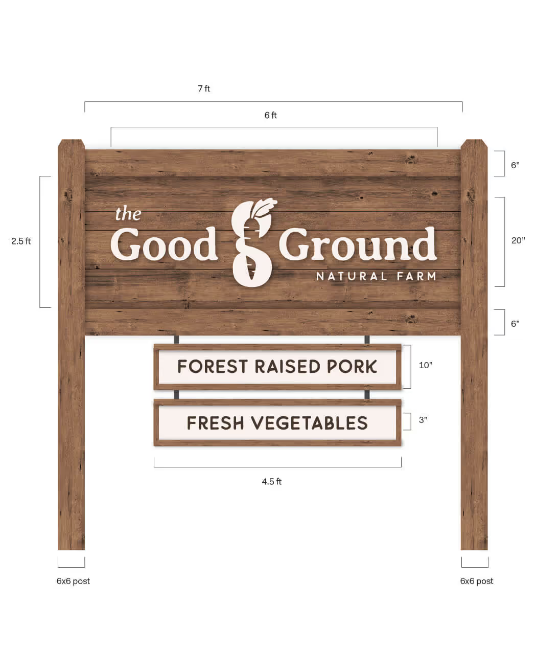
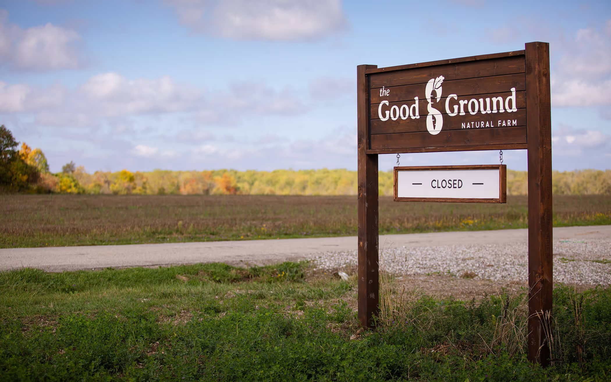
Rooted in the earth, The Good Ground places great importance on their location. To help make their farm accessible to the community, we helped them design and build a custom sign. Versatile by design, it can adapt to their growing seasons.

For more than a decade, our team has guided hundreds of businesses and organizations through branding and rebranding. Our approach explains and breaks down the creative process, bringing clarity and strength to your communication