Balsam Creek Case study

In an industry saturated with competitors, we were tasked with setting Balsam Creek apart from the rest. Their team works with obsessive craftsmanship, extreme attention to detail, and are highly skilled landscape specialists designing, constructing and maintaining properties of distinction. Their new brand now tells this story and helps to stop potential clients in their tracks.
To drive the branding in the right direction, we created a moodboard showing colour, textures, typefaces, styles, photos, and ideas. Each piece comes together to add to the story of Balsam Creek, a Canadian luxury landscaping company of exceptional quality.

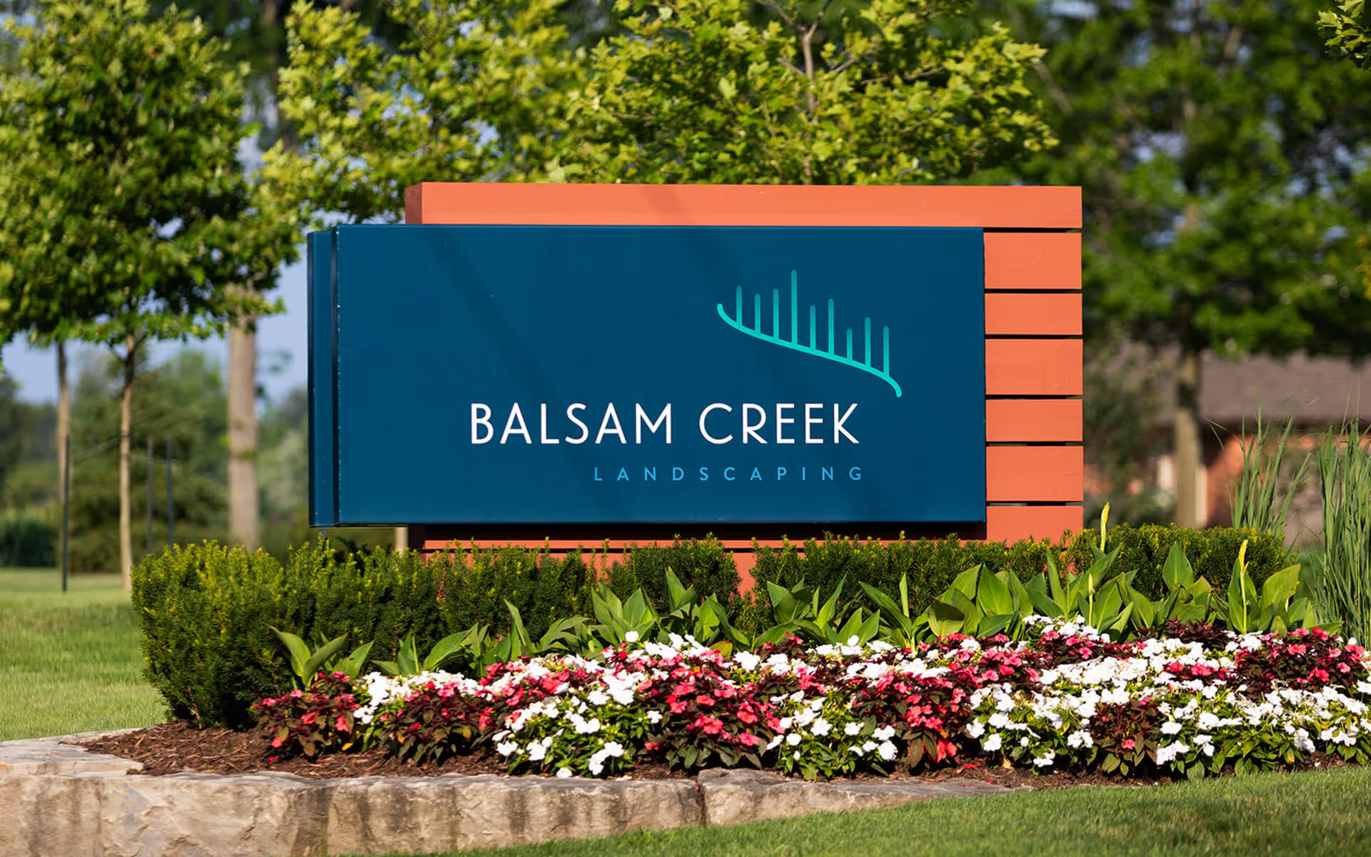
The original logo, while direct and readable, did not give the story of Balsam Creek to its audience. They had outgrown it, becoming a much more serious and luxury brand than their original branding presented.
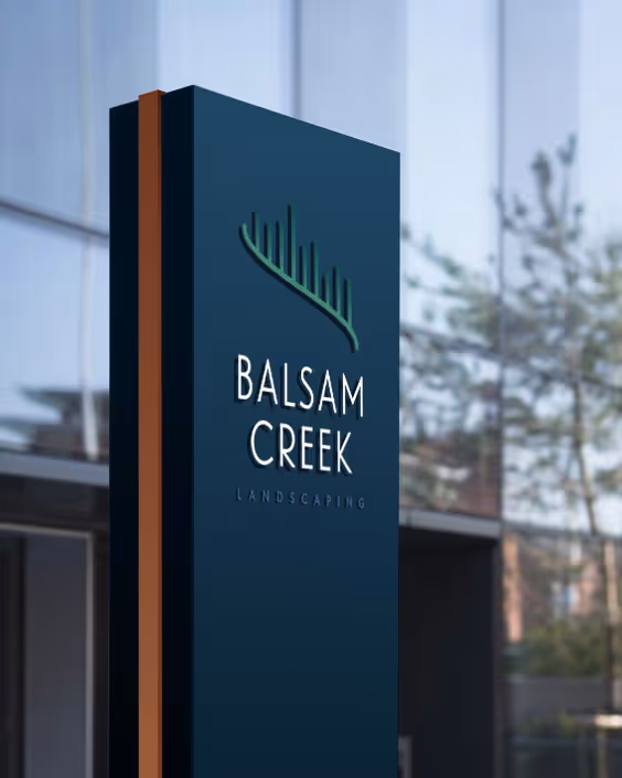
Inspired by the breathtaking beauty of the aurora and the gentle curves of a winding creek, this elegant monoline icon evokes a sense of forest, water, and sky all at once.

We chose a font that is simple, elegant, and readable but also speaks to the natural aspect of the business that they work in. It also had to speak to the simple elegance of the monoline icon.


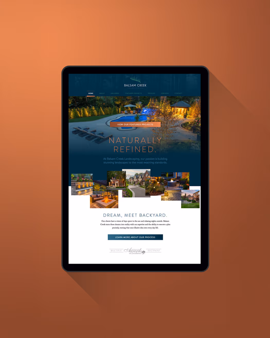
Distilling your story down to a few meaningful words can be difficult. “Naturally Refined” perfectly balances what Balsam Creek does with how they do it.


The original logo, while direct and readable, did not give the story of Balsam Creek to its audience. They had outgrown it, becoming a much more serious, luxury brand than their original branding presented.
Inspired by the breathtaking beauty of the aurora and the gentle curves of a winding creek, this elegant monoline icon evokes a sense of forest, water, and sky all at once.
We chose a font that is simple, elegant, and readable but also speaks to the natural aspect of the business that they work in. It also had to speak to the simple elegance of the monoline icon.
Distilling your story down to a few meaningful words can be difficult. “Naturally Refined” perfectly balances what Balsam Creek does with how they do it.
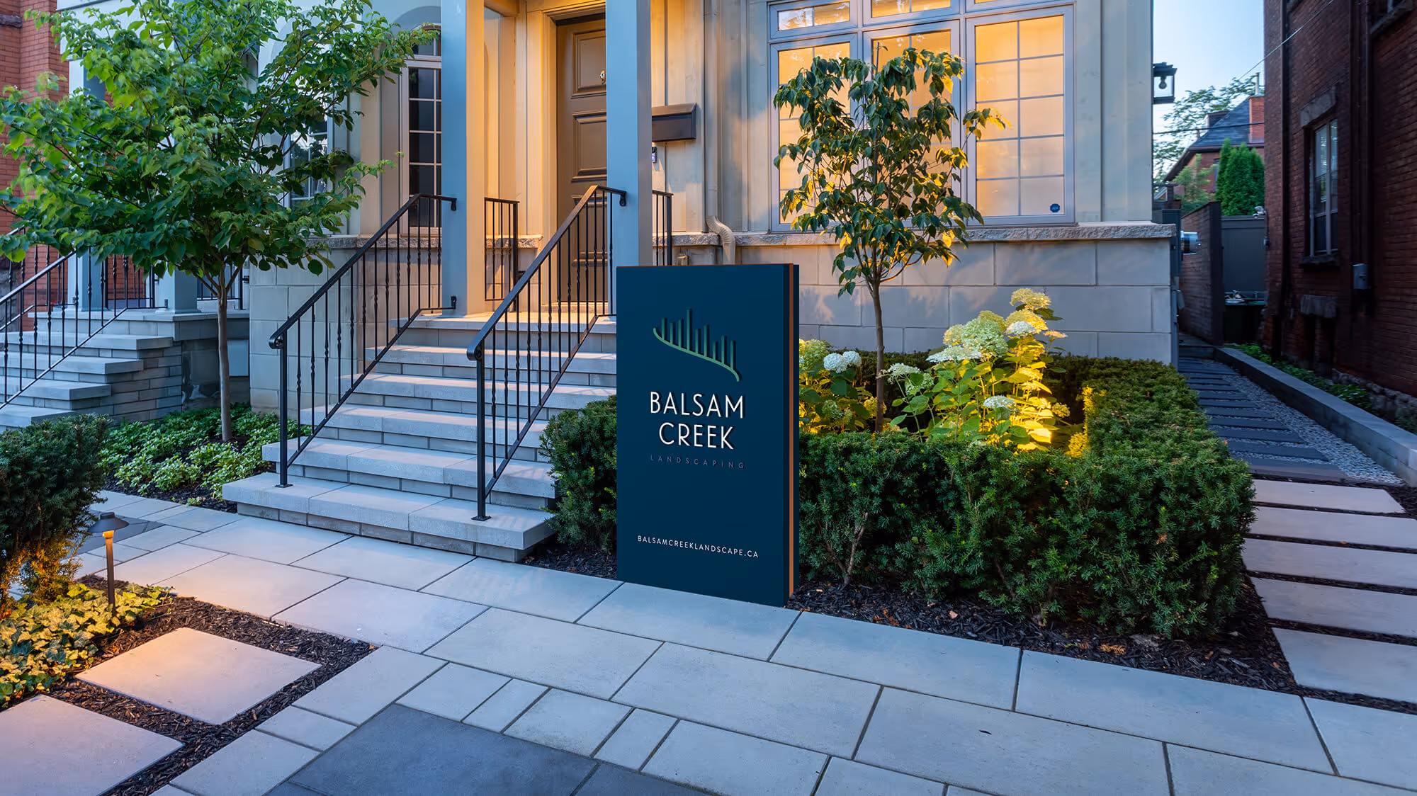
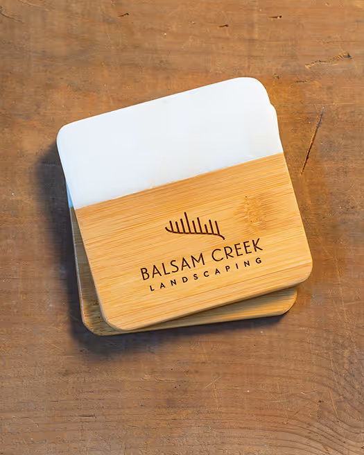
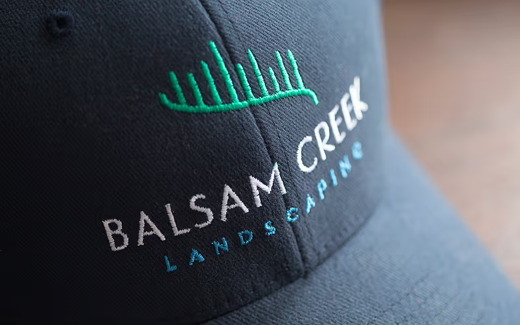
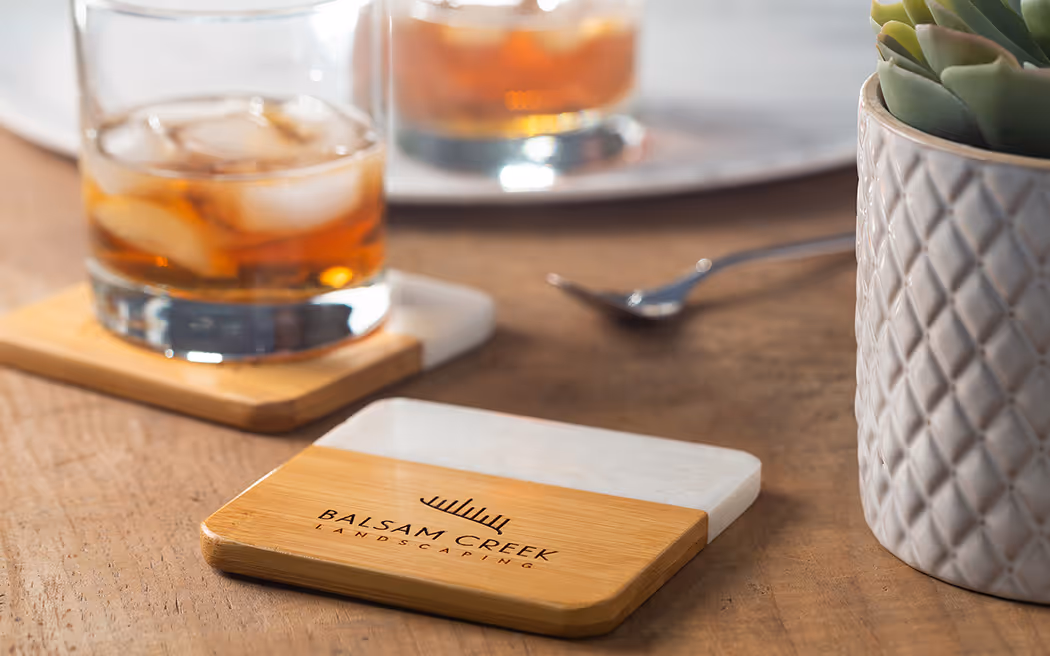
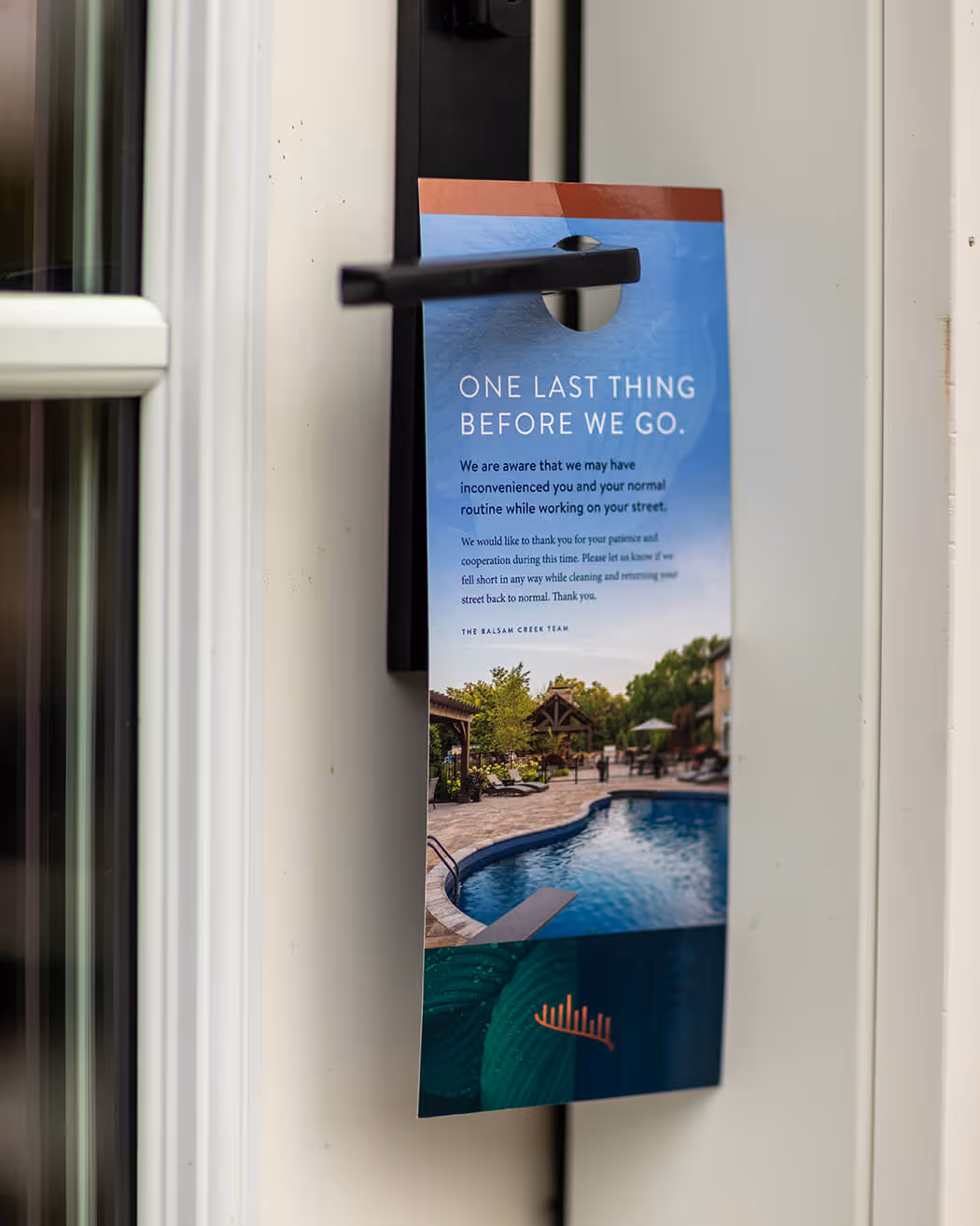
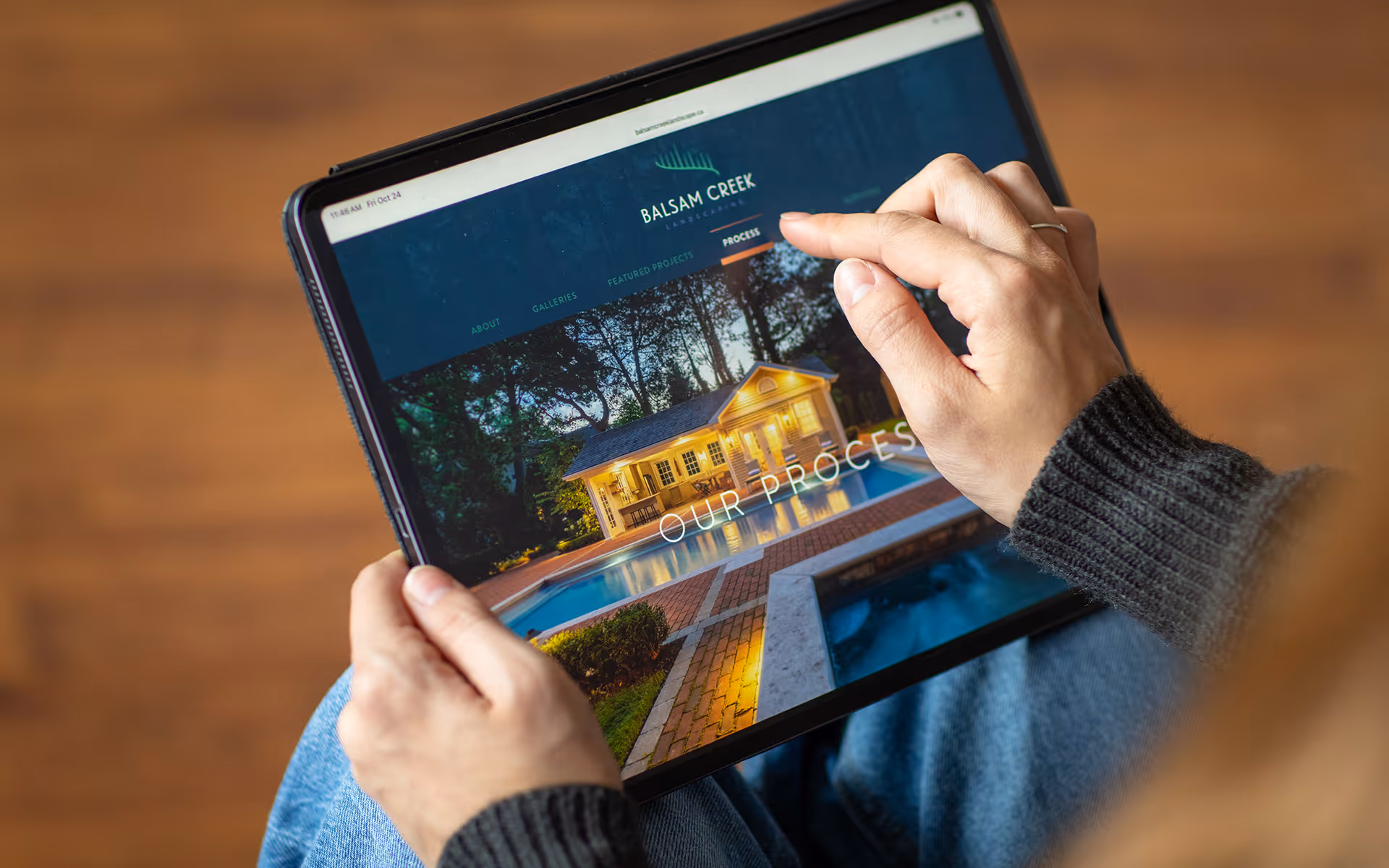
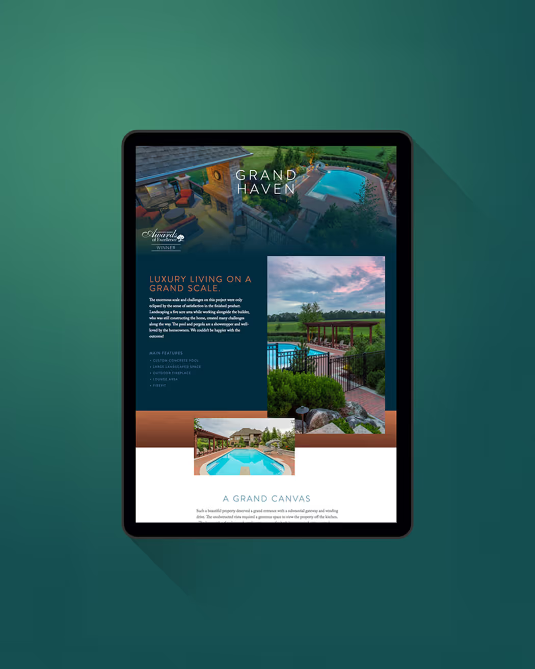
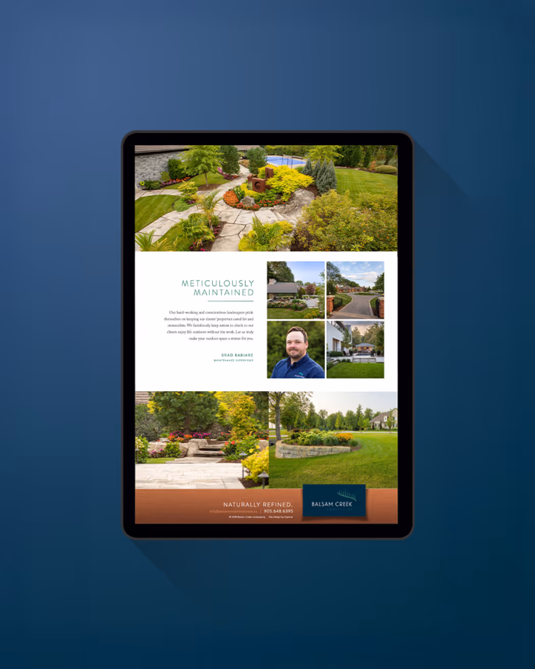
A brand is so much more than just a logo or a new tagline. We created a visual identity system for Balsam Creek that extends to every touchpoint of their business. From trailers and truck wraps, to door hangers and brochures – design, web development, photography and more were all done in house at Capture.

Working with Joel and the team at Capture Studio on our rebrand and website was an incredible experience. They understood exactly what we needed and delivered results that exceeded our expectations. We continue to rely on Capture for all our marketing needs, and every interaction with their team is a true pleasure.

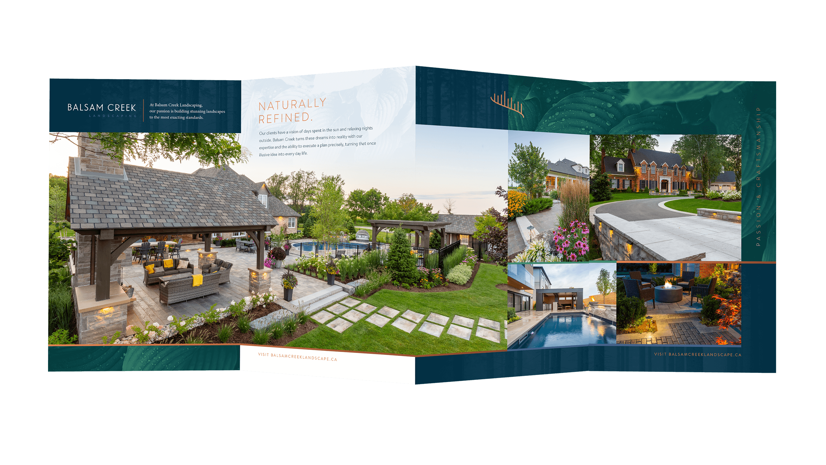

Print isn’t dead. Beautiful, physical pieces that present your brand are an effective strategy to share your story with potential clients and a tangible way to stay top of mind.
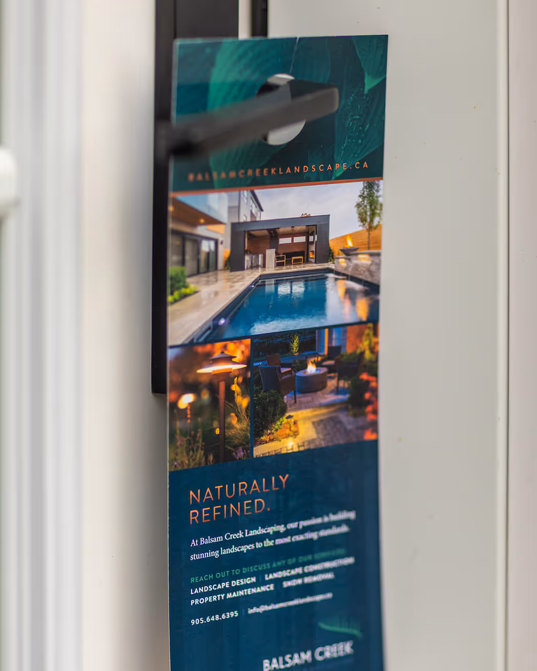
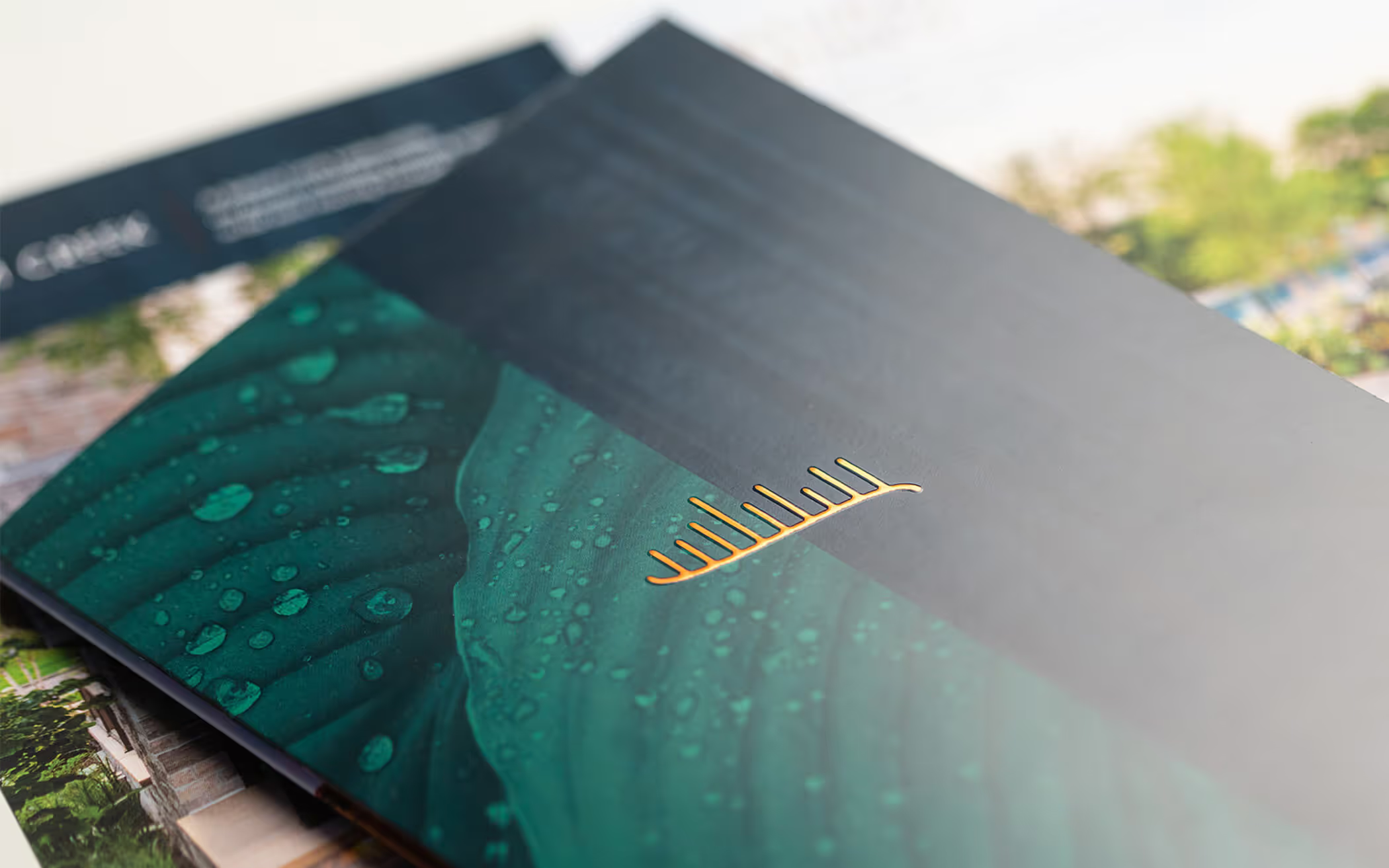
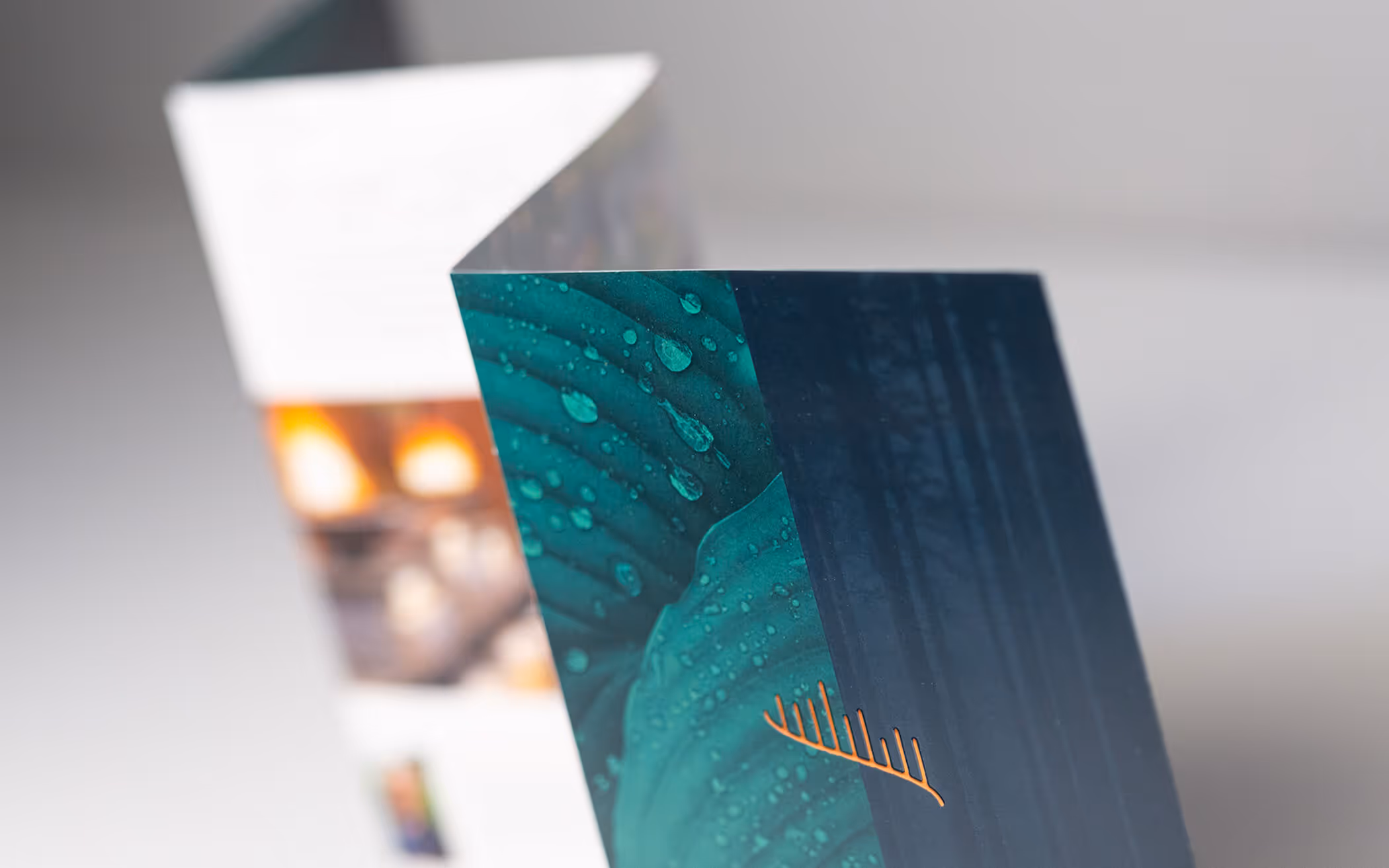
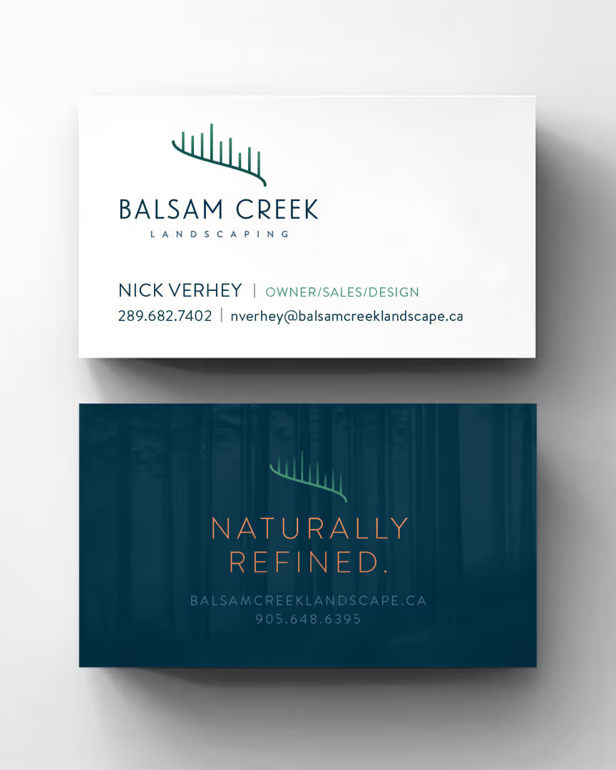

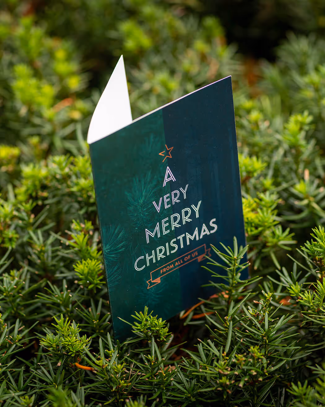
With Balsam Creek’s brand identity system in place, each new piece of corporate communication rolls out with purpose and consistency. Balsam Creek’s perception in the marketplace is now aligned with the immaculate work that they produce.

For more than a decade, our team has guided hundreds of businesses and organizations through branding and rebranding. Our approach explains and breaks down the creative process, bringing clarity and strength to your communication